The surface is part of the drawing
Woodcut and linocut are both relief processes. You remove areas that should remain unprinted, roll ink over the raised surface, and transfer that ink to paper. A line cut into either matrix usually prints as a light line against the inked areas. Yet a drawing copied onto wood and linoleum will not necessarily become the same print. Each surface offers a different amount and direction of resistance to the tool.
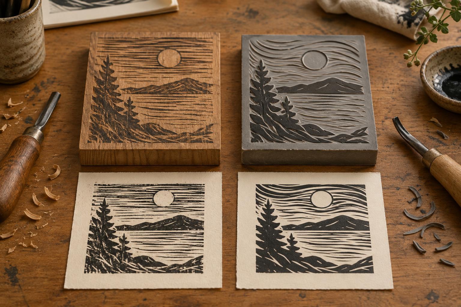
In a typical plank woodcut, the block is cut along the tree’s grain. That grain may guide a gouge through a long stroke, interrupt a curve, or show through as texture in an inked area. Linoleum has no wood grain, so the tool can travel more consistently in any direction. Neither result is inherently better: the useful question is whether you want the matrix to contribute visible character or leave more of the line’s direction to your hand.
How wood influences a cut
Wood offers a firm surface that can support crisp edges, though its behavior depends on the species, the way it was cut, and the condition of the block. Cutting with the grain often feels different from cutting across it. A stroke that changes direction may need a change in pressure or a different gouge. Rather than fighting those shifts, you can place long marks alongside the grain and use cross-grain cuts where a rougher edge serves the image.
The broad, raised areas of a wood block may also carry subtle grain into the print, especially when the surface and inking allow it. This can give a sky, wall, or shadow a texture you did not draw line by line. Make a small proof before committing to a large edition: grain that looks attractive in the bare block may be too prominent, or nearly invisible, once inked and printed. End-grain wood engraving is a related but distinct approach, usually worked with different tools and capable of much finer marks than a typical plank woodcut.
How linoleum changes the gesture
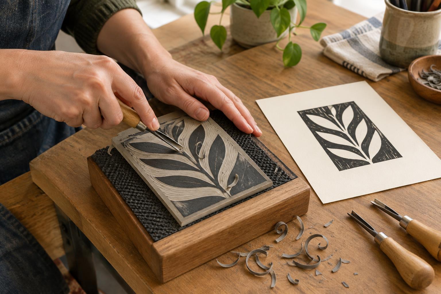
Linoleum is often appealing to beginners because it has no grain to steer the blade. Sweeping curves, repeated shapes, and cuts that turn sharply can feel more predictable. That evenness is also useful when an image depends on clean silhouettes or a rhythm of similar marks. A gouge’s profile matters: a narrow V-shaped tool can make a fine, pointed line, while a wider U-shaped tool clears broader channels. In either matrix, the depth and width of a cut affect how reliably it stays free of ink.
Not all lino feels alike. A fresh, workable sheet may cut smoothly, while an older or colder piece may resist the tool or crumble at an edge. Linoleum can show texture too, but it will not supply wood’s directional grain. If you want a busy surface, you will generally build it through your cuts, your inking, or both. Its apparent simplicity is an invitation to pay close attention to spacing: closely packed marks can merge visually in the print even when they look separate on the block.
Match the matrix to the image
Before choosing, identify the marks the image cannot do without. For a composition built from long directional cuts or a landscape that could benefit from incidental texture, try wood with the grain running in a useful direction. For a design with curves traveling every which way, linoleum may let you concentrate on shape and spacing rather than changes in resistance. Either material can produce bold areas of black and white; neither guarantees a particular style.
Think about the printing surface as well as the cutting experience. Large uncut areas need even inking and firm contact with the paper on either block. Very shallow cleared areas may pick up unwanted ink, while fragile raised details can be difficult to preserve or print cleanly. A proof is more informative than a rule: it reveals whether a fine line survives, whether a solid area prints evenly, and whether the texture supports the image.
A small test for your own hand
To compare the materials, draw the same modest design on a piece of wood and a piece of linoleum. Include a straight line, a curve, a short crosshatch passage, a solid shape, and an open area. Transfer the design to both blocks in the orientation you intend to print. Carve with sharp tools, secure each block on a non-slip surface, and keep your free hand out of the blade’s path. Work slowly; forcing a tool makes a controlled mark harder to achieve.
Print both blocks with similar ink, paper, and pressure, then place the proofs side by side. Look first at the marks rather than deciding which print is ‘better.’ Did one surface encourage longer cuts? Did a curve change shape? Which cleared areas remained clean, and where did unexpected texture appear? Those observations can guide the next drawing. The most useful matrix is the one whose resistance helps you make the marks you want.