A Picture That Could Print with Words
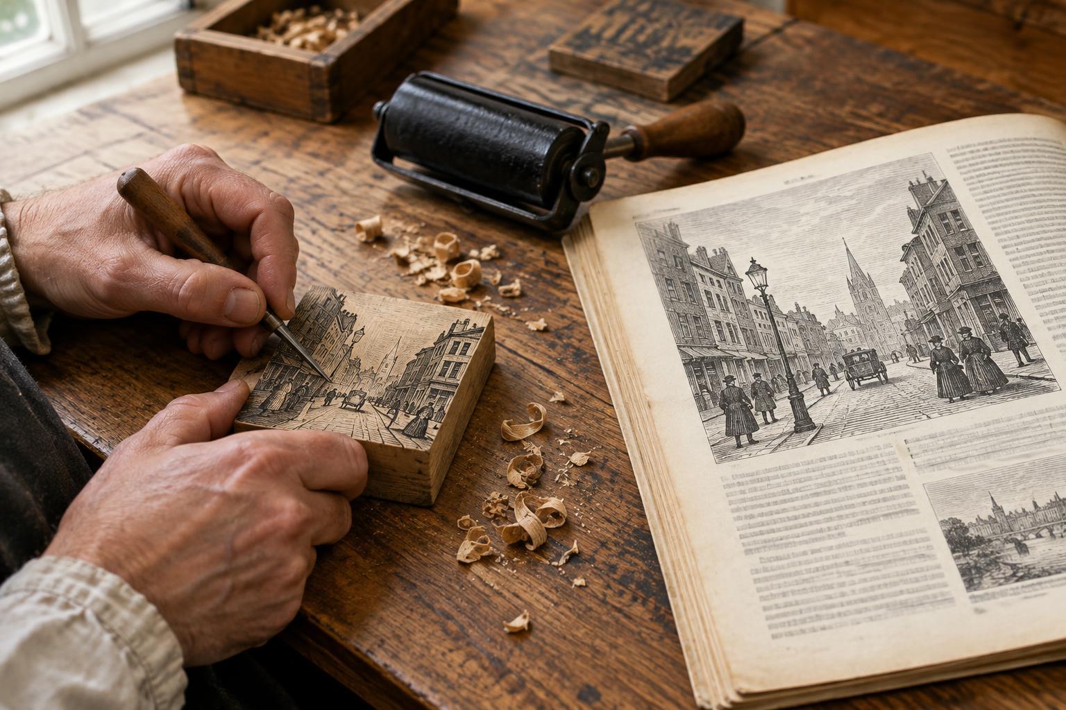
The nineteenth-century illustrated press needed a practical way to put images beside columns of type. Wood engraving offered one. Like a woodcut, it is a relief process: the raised parts of a block receive ink and print, while areas cut away remain the color of the paper. A finished block could be made type-high, allowing a printer to set it in a forme with movable type and print words and pictures in the same press run.
This compatibility mattered as illustrated newspapers and magazines sought to publish scenes of public life, travel, industry and everyday events. The technique did not make pictures effortless or instantaneous. Each image still required drawing, cutting and printing. But it gave publishers a way to produce detailed illustrations in substantial quantities without printing every picture as a separate plate.
What Makes a Wood Engraving Different?
A traditional woodcut is generally cut along the grain of a plank, often with knives or gouges. Wood engraving typically uses the end grain of a dense wood, such as boxwood, and is cut with engraving tools called burins. The firm end-grain surface supports fine lines and small details. Because the engraved marks print white, an engraver can build an image by cutting light into a dark surface.
Thomas Bewick’s work helped establish the expressive possibilities of this approach around the turn of the nineteenth century. In later illustrated publishing, engravers used varied marks to suggest light, texture, movement and depth. A cloudy sky might be made from closely spaced cuts; a coat could be described with short, angled strokes. Those effects are worth looking for on the page. They show how much visual information could be carried by black ink and unprinted paper alone.
From Reported Scene to Printed Image
An illustration in a nineteenth-century periodical was often the result of several people’s work. An artist might observe a scene directly or prepare a drawing from accounts and other visual material. The design then had to reach an engraver, who interpreted it in printable marks. Editors, compositors and printers shaped its final appearance through placement, captions, type and presswork. Not every published image followed the same path, so a printed engraving should not automatically be treated as an eyewitness record.
For a large image, a design could be transferred to a block assembled from smaller pieces. Different engravers could work on separate sections before the pieces were joined for printing. This divided the labor, though maintaining consistent tones and making the joins unobtrusive called for care. Publishers could also use a metal duplicate made from the original block for repeated printing, helping preserve the carved surface. The image a reader held was therefore both an artwork and the product of a coordinated publishing process.
Reading an Engraving as Evidence
The illustrated press made unfamiliar places and events visible to readers, but visibility is not the same as neutrality. A scene may have been simplified to fit a page, composed for dramatic effect or engraved from a drawing made at a distance from the event. Captions and surrounding articles also guide interpretation. When studying an illustration, begin with questions: What does the image emphasize? What falls outside its frame? Does the caption identify how the scene was observed?
The printed surface offers clues of its own. Compare broad black areas with passages of fine white lines, and notice where detail becomes dense or sparse. Look at how the illustration shares space with text: a small image embedded in a column invites a different kind of attention from a large picture spread across a page. Considering both the marks and their setting makes it easier to see the engraving as a deliberate piece of communication, rather than a transparent window onto the past.
A Small Studio Exercise
You can explore the technique’s visual logic without attempting a historical reconstruction. Make a simple relief print from a material and tools suited to your experience, following their safety guidance. Draw a subject with one dark area, one light area and a textured middle tone. As you cut, remember that removed areas will stay the color of the paper. Print a few proofs, changing only the spacing or direction of your texture marks between versions.
Place one proof beside a short paragraph you have written about the subject. Does the image explain something the words do not, or does the text change how you read the image? Nineteenth-century publishers faced that relationship on every illustrated page. The exercise makes their central challenge tangible: turning a drawing into repeatable marks, then placing those marks where a reader will make sense of them.