Start with the image and the printing method
A good lithography paper does more than carry an image. Its surface influences whether fine crayon marks remain distinct, how solid areas appear and how easily a sheet passes through the press. Before buying paper for an edition, consider what the image asks of it: delicate lines, broad ink-rich areas, multiple colors or a visible paper texture.
Stone and plate lithography share the need for reliable contact between inked surface and paper, but the setup matters. A stone press and a plate press may use different pressure arrangements, blankets and registration methods. Ask what your particular press can handle comfortably rather than assuming that a paper used for one process will behave identically in the other. Keep a few candidate sheets for proofs before committing to a full pack.
Match the surface to the marks
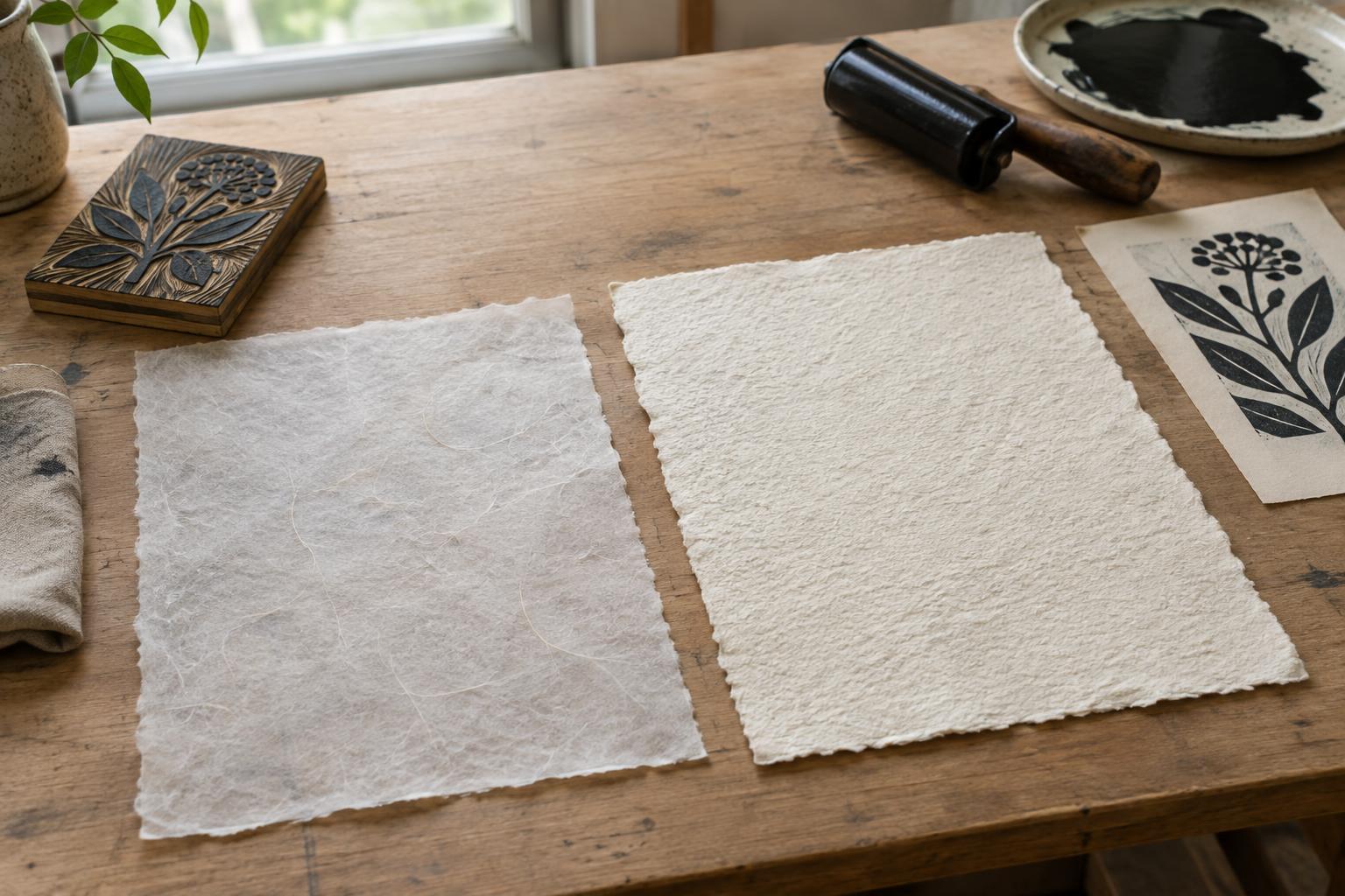
Smooth papers usually give fine lines and subtle tonal marks a more even contact area. If your drawing includes delicate tusche washes or closely spaced crayon textures, begin with a smooth or moderately smooth printmaking sheet. A heavily textured surface can leave tiny gaps where the ink does not fully meet the paper. Those gaps may be attractive, but they can also obscure details you intended to keep.
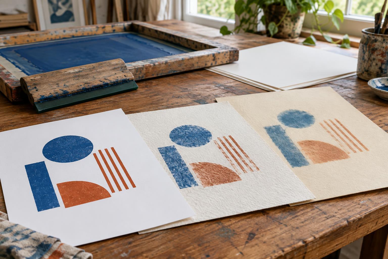
Texture remains a creative choice. A softly textured sheet can give a bold image warmth and make the paper an active part of the print. Test it with the densest and finest parts of your image, not just an open area. Notice whether the texture is consistent across the sheet: pronounced changes from one area to another may become distracting in an edition, especially when printing flat tones or repeated color layers.
Consider sizing, absorbency and color
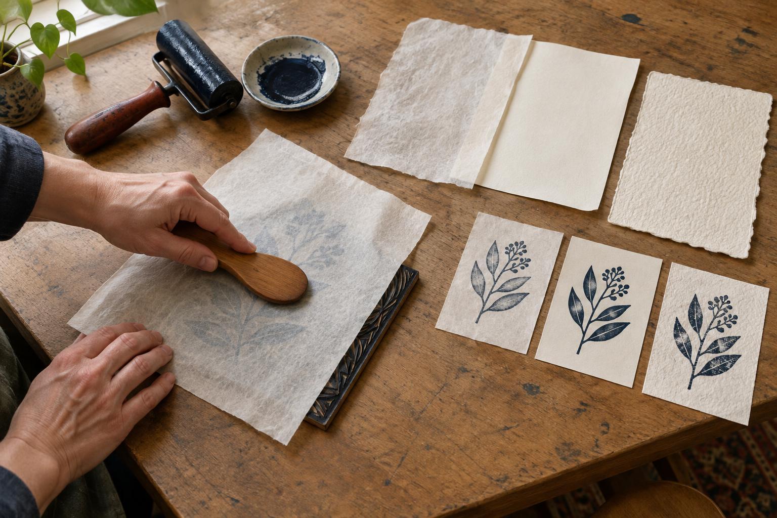
Sizing affects how readily paper takes up moisture and ink. A highly absorbent sheet may make printed areas look softer or duller than expected, while a harder, well-sized surface may keep edges sharper. Neither response is automatically better. Compare proofs after the ink has settled, and check whether darks, fine marks and unprinted areas have the character you want. If your workflow involves dampening the paper, test that step separately; the moisture used on a lithographic stone or plate does not mean every paper should be soaked.
Paper color also changes the image. A bright white sheet can emphasize contrast and cool colors, while a warm white or cream sheet may soften the overall effect. Look at the paper beside your ink choices under the lighting in which you normally assess prints. For work you hope to store or present for a long time, consider a printmaking paper described as acid-free and check the maker’s specifications rather than judging permanence from appearance alone.
Choose a sheet that handles the press well
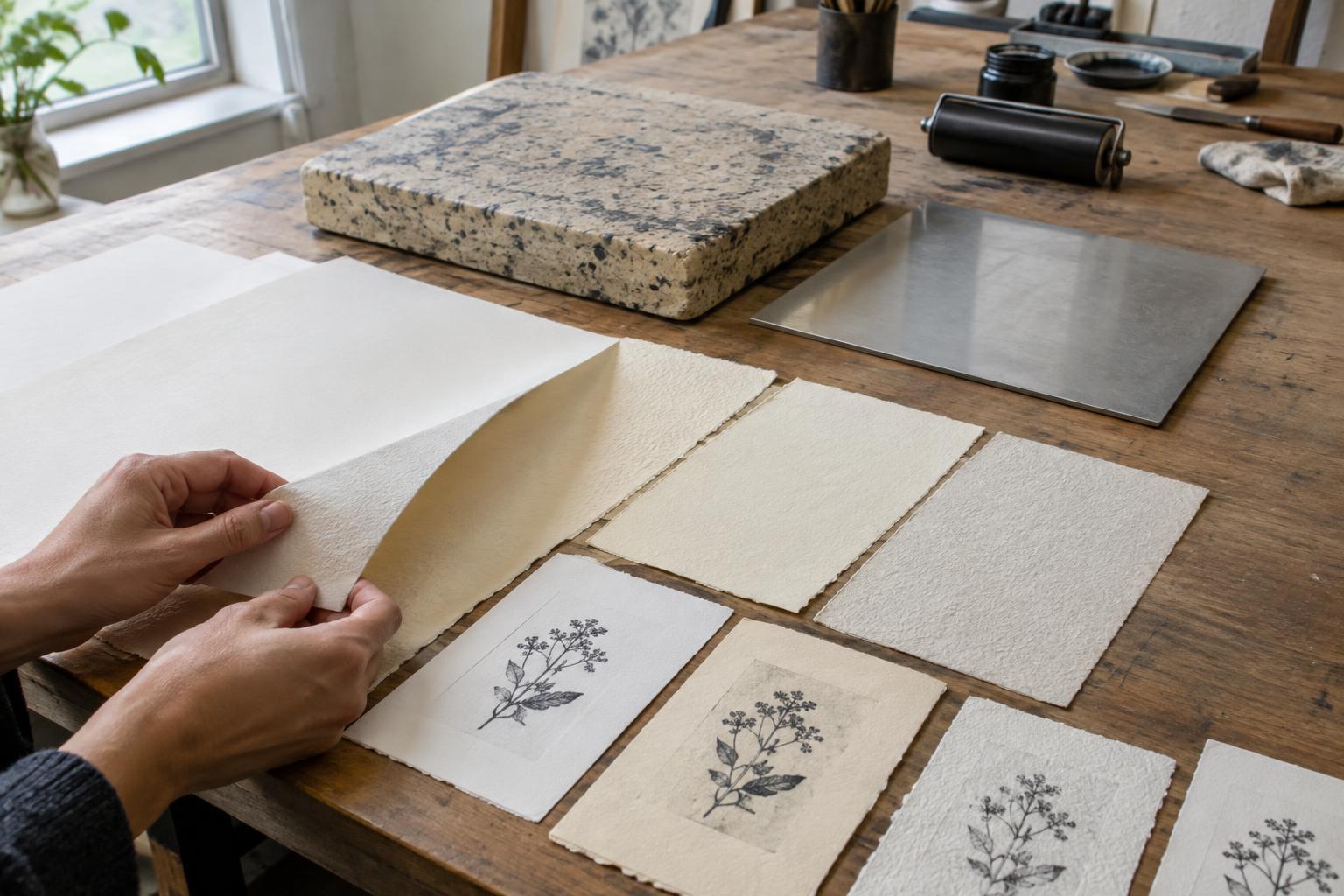
Weight and flexibility matter as much as surface. A very light paper can be easy to handle but may wrinkle, shift or show handling marks during a demanding run. A very heavy sheet may feel substantial yet prove awkward under a particular press setup or when careful registration is needed. Aim for a sheet you can place, lift and inspect consistently. If you plan to tear paper down from larger sheets, allow generous margins for registration marks, gripping and later presentation.
Pay attention to the paper’s grain and to differences between its two sides. Some sheets have a noticeably smoother face; printing on the opposite side may change the result. Keep your sheet orientation consistent, especially for multicolor work. Cut and label test sheets in the same orientation you intend to use for the edition, and check that the paper remains reasonably flat in your studio’s conditions.
Proof before buying for an edition
Make a small comparison set using the same image, ink and press settings for each candidate paper. Print a section that includes fine marks, open tones and a dense area. Label each proof with the paper name, printing side and any relevant handling notes. Changing only the paper at first makes its effect easier to see; you can adjust pressure or ink later if a promising sheet needs refinement.
Once you choose a paper, obtain enough from a consistent supply for the planned edition, proofs and likely spoilage. Store sheets clean, flat and protected from abrupt changes in humidity. The most useful paper is not necessarily the most expensive or the thickest: it is the one that prints your image well, works predictably with your equipment and lets you repeat the result from the first good impression to the last.