What paper texture changes
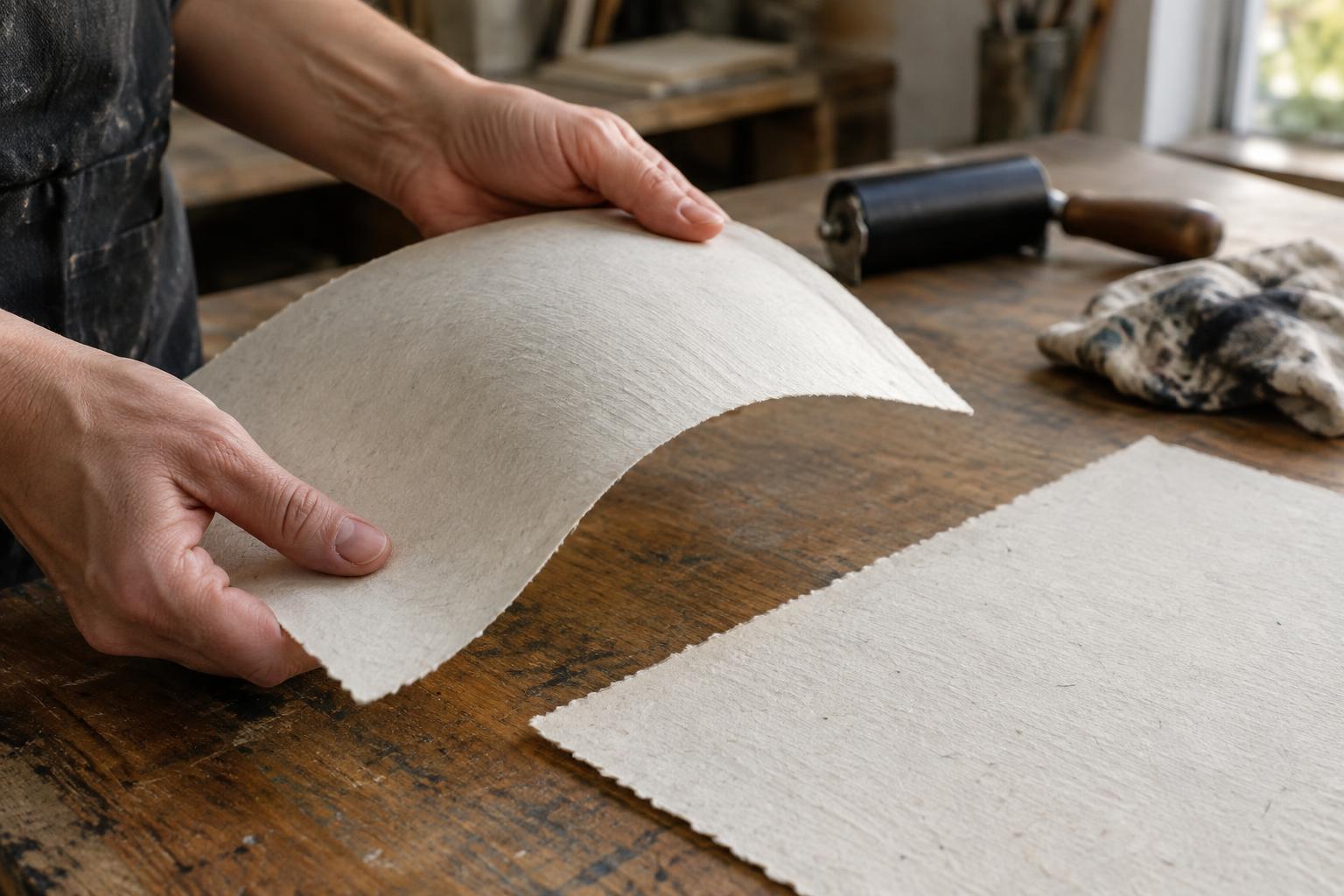
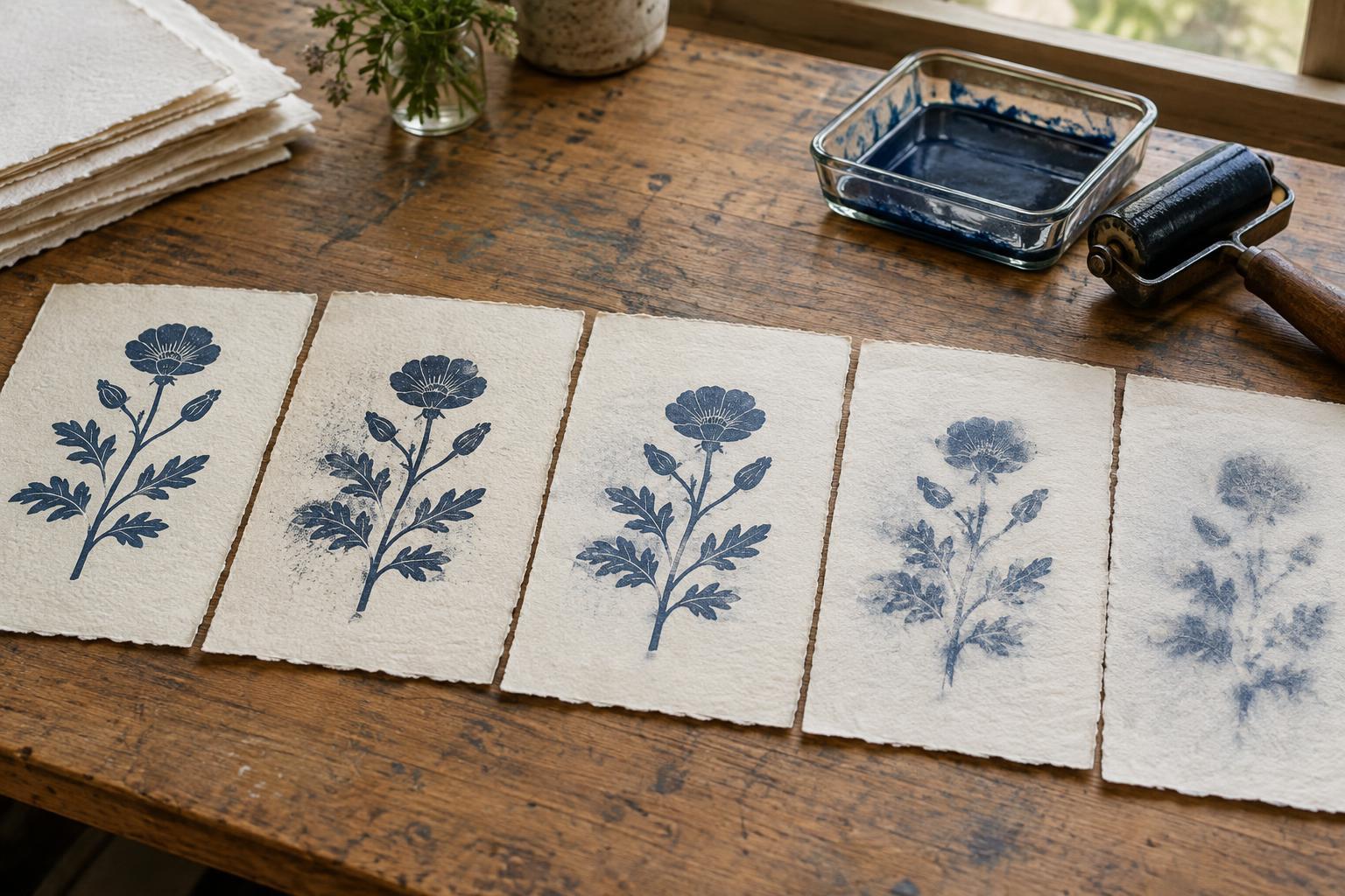
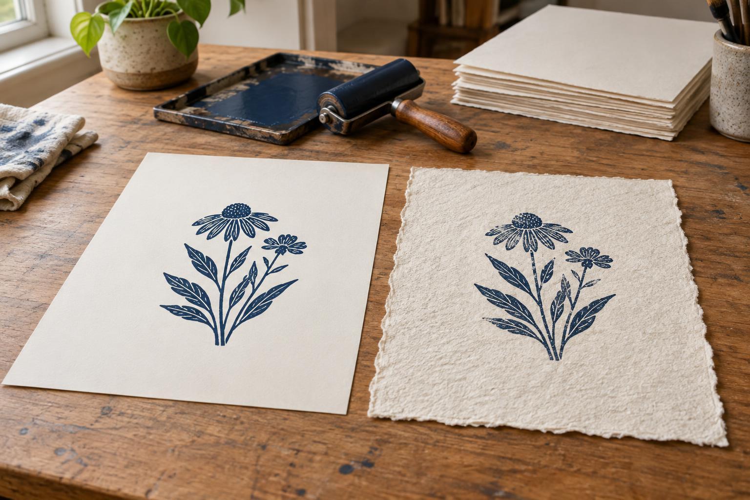
A paper’s surface is part of the image-making process. On a smooth sheet, the printing surface can make relatively even contact with the paper, which helps fine lines and flat areas of color appear clean. A textured sheet has raised areas and shallow hollows. Depending on the technique and pressure, ink may reach the raised areas more readily, leaving a broken or speckled impression.
Texture also changes how a print feels and looks beyond the inked image. A pronounced surface can add warmth to a simple composition, while a smooth surface can keep attention on precise marks. Neither is inherently better. The useful question is whether the paper supports the effect you want—and whether it will do so consistently across the number of prints you plan to make.
When smooth paper is the easier choice
Smooth paper is often a good starting point for small type, thin lines, tight registration, or broad areas that should print evenly. In relief printing, where ink sits on the raised parts of a block, a smooth sheet generally needs less effort to contact those parts. This can be especially helpful when printing by hand with a baren or spoon, since pressure may be less uniform than it is in a press.
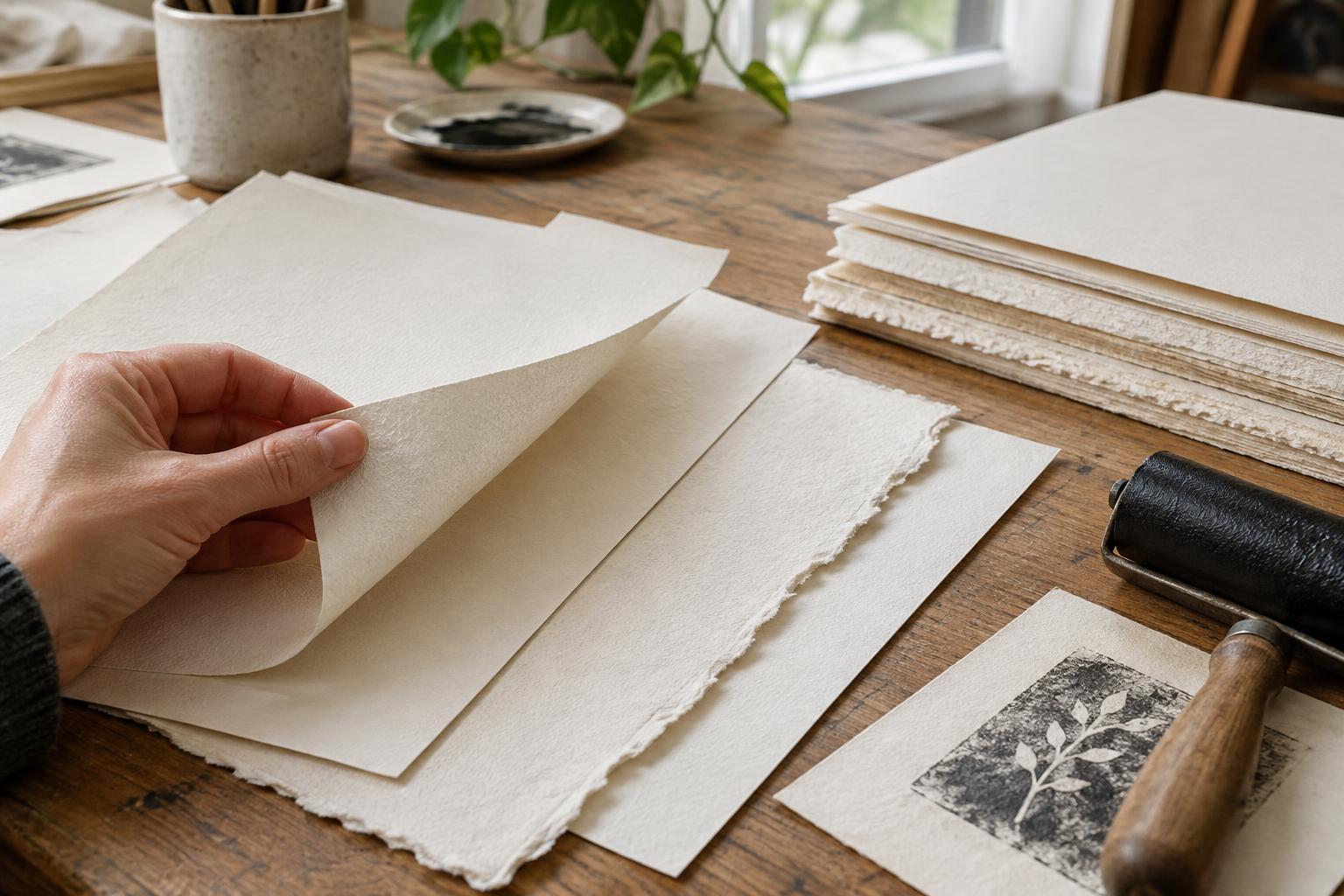
Smooth does not necessarily mean thin, glossy, or slippery. Printmaking papers vary in weight, stiffness, absorbency, and surface treatment even when they feel similar to a fingertip. A sheet that takes ink sharply may still be too light for vigorous rubbing, while another may resist ink in a way that changes drying or color. If you are working with a new paper, test the actual ink and pressure you intend to use rather than judging by touch alone.
When texture earns its place
Textured paper can complement bold relief cuts, loose monotypes, and images that benefit from visible variation. Its surface may make a solid printed shape look less uniform, adding a sense of grain without changing the block or plate. It can also give an unprinted border a distinct presence, which matters when the paper itself will remain visible in the finished work.
The effect depends on how the image is transferred. A press may push some textured papers into closer contact with an inked surface than hand pressure can. In intaglio, suitably dampened paper is pressed into recessed lines, so softness and flexibility matter alongside visible texture. For screen printing, a strongly textured sheet may make crisp edges or even coverage harder to achieve. These are tendencies, not rules: the depth of the texture, the ink, and the equipment can change the result.
Be cautious about choosing a dramatic surface solely from a sample book. A texture that looks appealing on an empty sheet can compete with delicate marks or make closely spaced details harder to read. Sometimes a lightly textured paper provides the character you want without taking over the image.
Look beyond the surface finish
Before buying paper for a project, consider its weight and handling. Can it withstand the pressure, rubbing, or repeated passes your process requires? Will it stay manageable at your chosen size? A heavier sheet is not automatically the best sheet, but very light paper may wrinkle or become difficult to register. The paper’s color also affects the print: warm white can soften a palette, while bright white may make contrast feel stronger.
Absorbency and sizing—the treatment that influences how readily paper takes in moisture and ink—also matter. Two papers with equally smooth surfaces can print differently because one absorbs more quickly. If your process uses damp paper, follow guidance for that paper and introduce moisture gradually; not every sheet is suited to soaking. For work you hope to keep or sell over time, look for clear information from the paper maker about the sheet’s composition and intended use rather than assuming a particular texture signals durability.
Run a small comparison before printing the edition
Cut test pieces from two or three candidate papers, leaving enough room to handle and label each one. Print the same image with the same ink, inking method, and approximate pressure. Include an area of fine detail and an area of solid color if your image has both. Let the samples dry as you normally would before comparing them; wet ink can conceal differences that become obvious later.
Examine the tests in good light. Are the edges clear enough? Do the solid areas look satisfyingly full, or is their broken texture part of the appeal? Check whether the paper buckled, picked up unwanted marks, or was awkward to register. If one result nearly works, change one variable at a time—such as pressure or ink application—so you can tell what helped.
Once you choose a sheet, record its name, weight if known, which side you printed on, and any dampening or pressure adjustments. Keep a labeled test with your notes. That small record makes it easier to repeat the result and helps you distinguish a deliberate paper effect from an unexpected printing problem.