Decide what the edition is meant to share
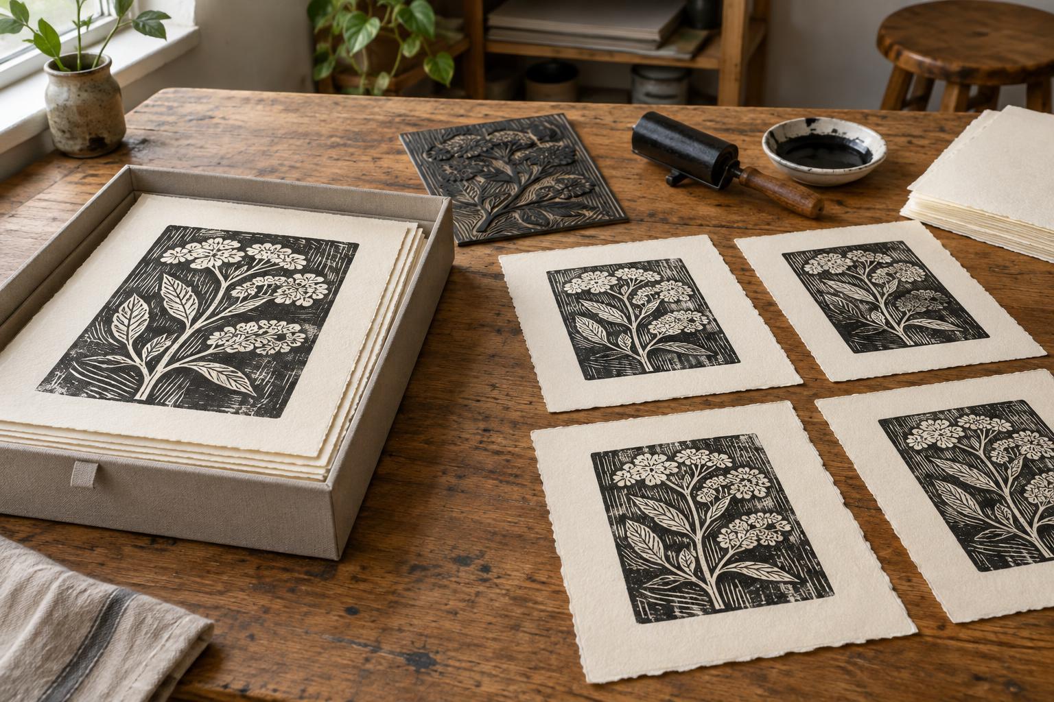
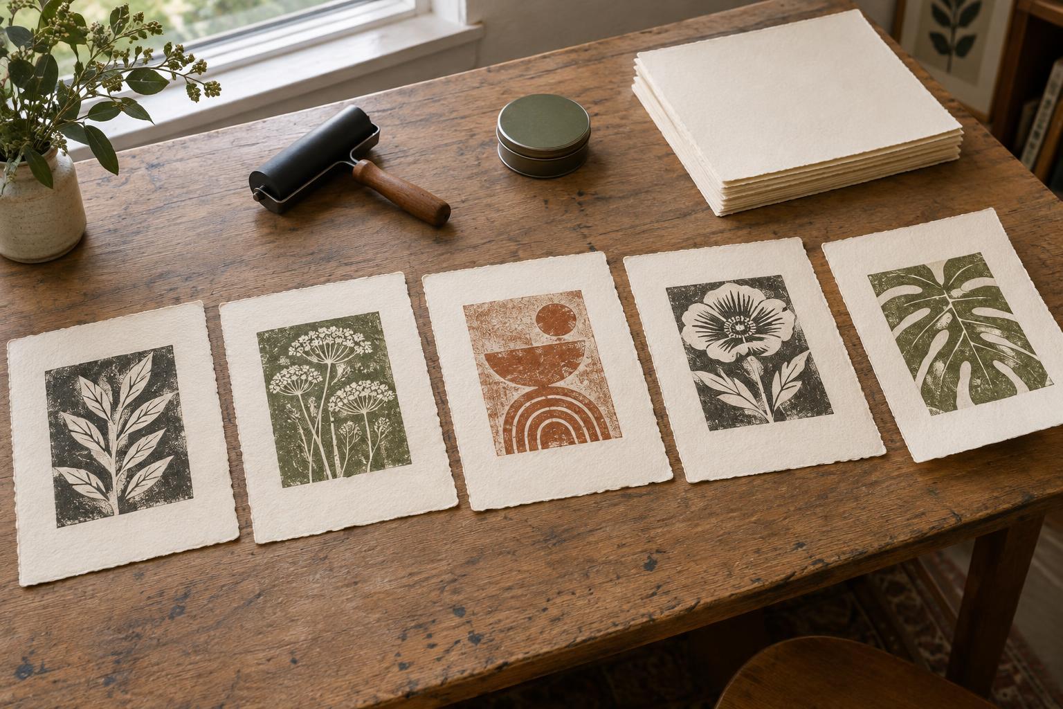
A print edition is a group of impressions presented as versions of the same work. That does not mean every sheet must be indistinguishable. Hand printing, textured surfaces, and techniques such as monotype may invite variation. The useful question is which features make each impression recognizably part of this edition, and which differences would change the work.
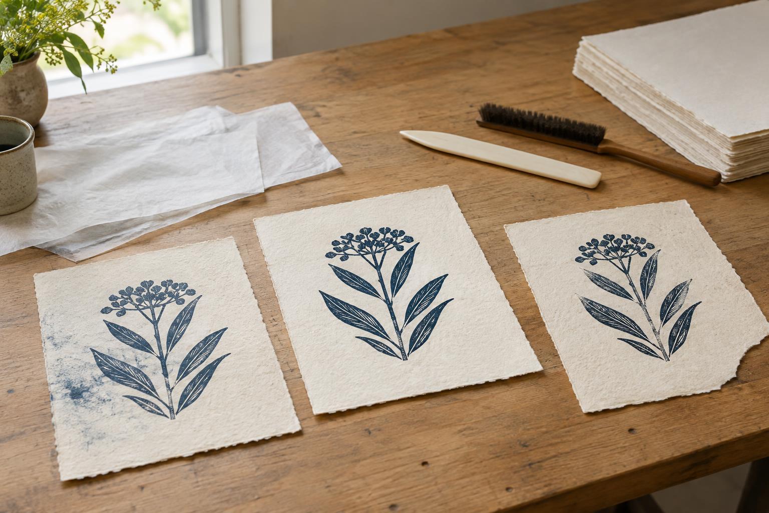
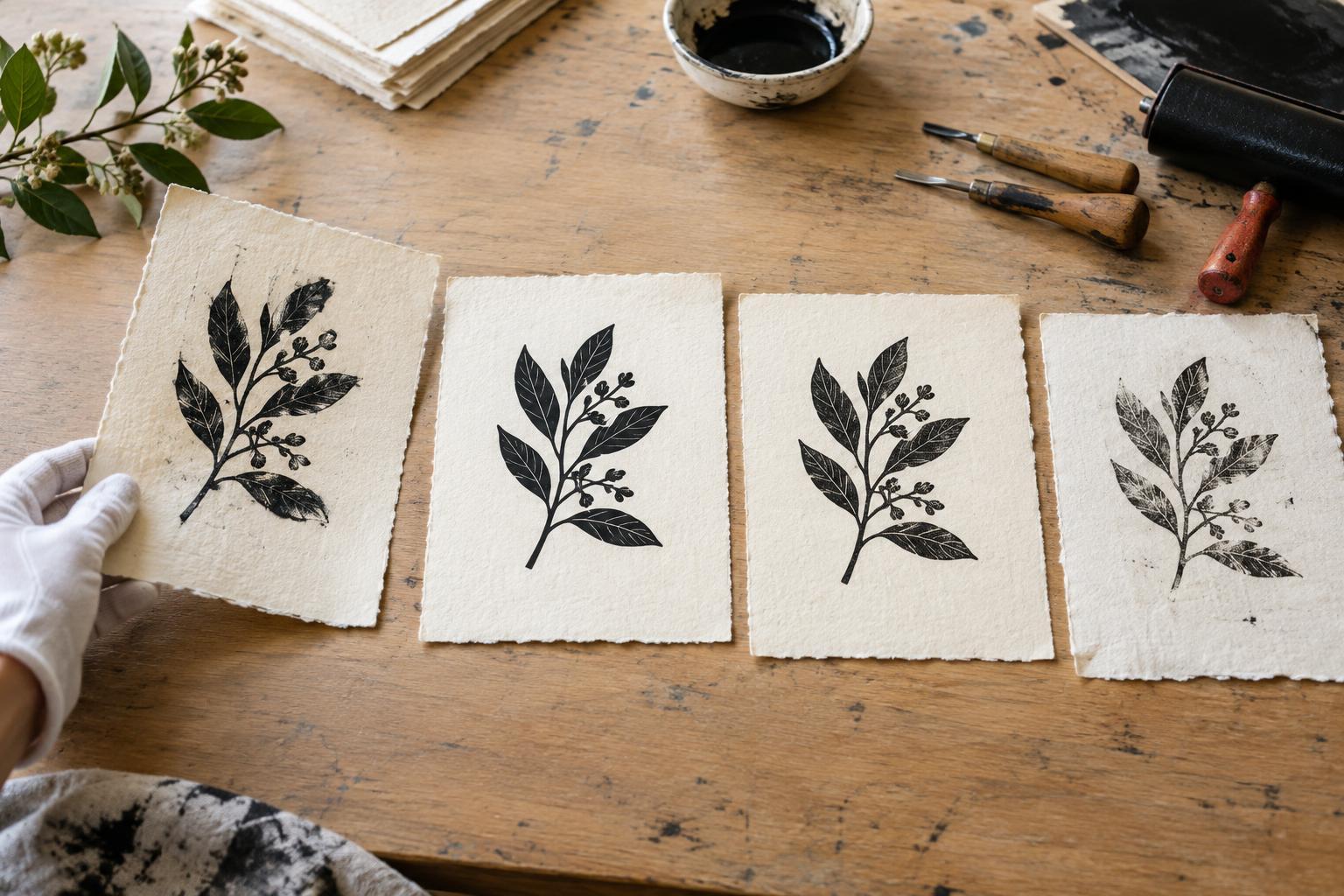
Before committing to an edition size, make several trial impressions. Compare the image area, ink coverage, color, registration, paper, and margins. Decide which choices are fixed and which can vary. A small shift in grain or plate tone might be welcome; a missing line or a color printed in the wrong place might not be. If substantial changes are intentional, consider whether they belong in a separately identified variation rather than a single uniform edition.
Choose a reference proof and define tolerances
Select a proof that shows the result you are aiming for, then keep it near the press or printing area. It serves as a reference, not as a promise that every sheet will be a perfect copy. Note the settings and choices that helped produce it: paper type and orientation, ink mixture, wiping or rolling method, registration setup, pressure, and drying arrangement. A photograph may help with records, but the physical proof is more useful for judging surface and color.
Write down your tolerances in terms you can actually check. For example: the full image must print, both colors must fall within the intended registration area, and margins must leave enough room for the planned presentation. You can also name acceptable variation, such as modest differences in wiping that do not obscure important details. These notes turn a vague feeling of “good enough” into a repeatable decision.
Inspect every impression at the right time
Build inspection into the printing sequence rather than waiting until the end. Check early impressions against the reference proof; if the result begins to drift, pause to clean the plate or block, adjust ink, or examine the registration guides. Set each sheet aside in a way that preserves its printing order. This makes it easier to spot gradual changes, such as ink building up in fine marks.
Inspect again after the prints are dry enough to handle safely. Look at the whole image first, then check details, paper edges, margins, smudges, fingerprints, and any damage from handling. View the sheets under reasonably consistent light. A fresh print can look different once dry, and flaws near an edge may become conspicuous after trimming or framing. Keep a separate stack for sheets that need a second look rather than deciding in a rush.
Separate rejects, working proofs, and edition prints
Not every sheet needs to become part of the edition. A reject may have a printing fault, damaged paper, or a result too far from the agreed standard. A working proof can still be valuable for testing an adjustment, even if it is not suitable for presentation. Mark and store these categories separately so a sheet is not accidentally numbered later.
Count the prints that pass inspection before finalizing the edition. If you planned twenty but only sixteen meet the standard, you can print more while the matrix and setup still allow it, or choose a smaller edition. Avoid numbering a flawed sheet simply to reach the original target. If the matrix changes significantly during printing, record when and how; that information helps you decide whether later impressions should be identified as a different state.
Finish with a clear, consistent record
Once the accepted prints are dry and ready, number and sign them according to the presentation approach you have chosen. Keep the placement consistent, and use a marking method suitable for the paper. If you include artist’s proofs or other separately identified impressions, record them as well. Edition labels are most helpful when they accurately describe what exists, rather than implying that unprinted or rejected sheets are finished works.
An edition record can be simple: title, process, paper, ink or colors, image and sheet dimensions, edition size, proof categories, and notes about meaningful variation. Store it with the reference proof. This gives you a reliable guide if you present the prints later and a useful starting point for your next project. Quality standards are not about removing the life from a handmade print; they are about knowing which differences serve the image and presenting every accepted impression with care.