What Japonisme describes
Japonisme is a term for the European fascination with Japanese art and design that grew during the second half of the nineteenth century. Woodblock prints were especially influential because they could be collected, studied and displayed alongside European prints. Artists encountered images of actors, city life, landscapes and intimate domestic scenes that looked strikingly different from the academic art they had been taught to admire.
The term describes a European response, not a Japanese art movement. The prints that attracted European collectors came from varied makers and traditions, including the ukiyo-e work of artists such as Hokusai, Hiroshige and Utamaro. Nor did every European artist respond in the same way: some collected prints, some adapted particular visual devices, and others made work that referred explicitly to Japan.
A different way to arrange a picture
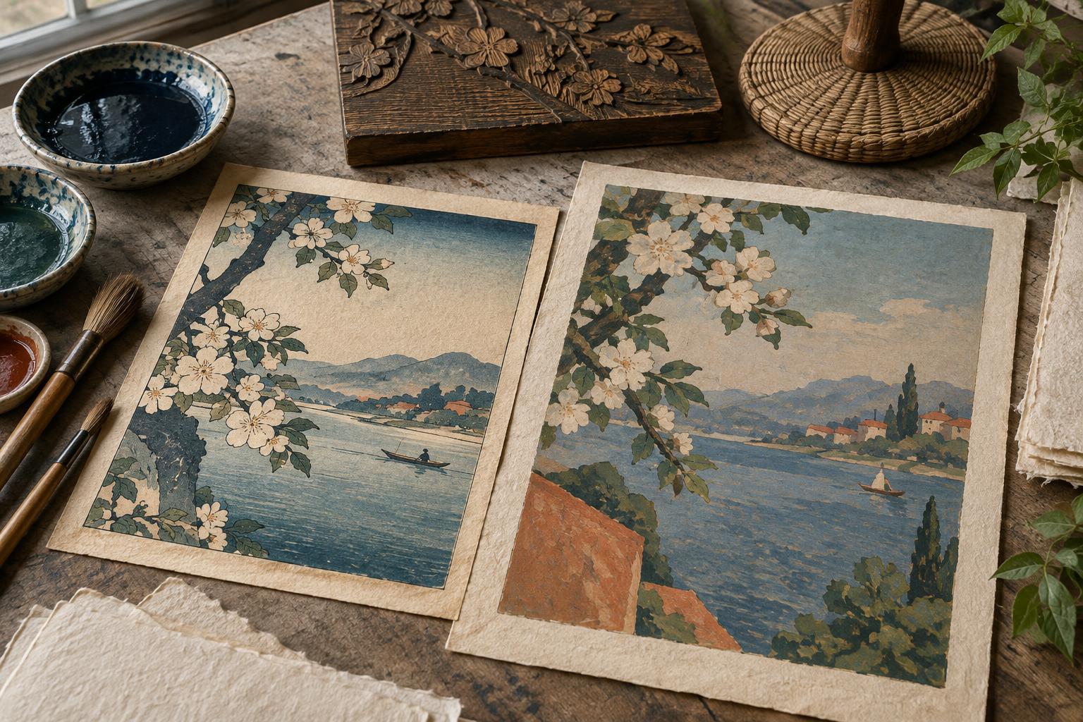
One of the most visible influences was compositional. In many Japanese prints, a bridge, branch or figure enters from the edge of the image; a subject may be partly cut off rather than placed neatly in the center. Broad areas of relatively even color can sit beside lively patterns and strong outlines. Instead of leading the eye toward a single vanishing point, a print may ask the viewer to move between near and distant forms.
These features were useful to European artists exploring scenes of modern life. Edgar Degas used unusual viewpoints and off-center arrangements in depictions of performers and everyday interiors. Henri de Toulouse-Lautrec brought bold silhouettes, flat color and dramatic cropping to lithographic posters. Their works were not copies of Japanese prints, but the comparison helps explain why familiar subjects could suddenly appear fresh and immediate.
Color, subject matter and the printed image
Japanese prints also showed how color could organize an image without carefully modeled shadows. A limited range of distinct color areas could establish weather, mood or rhythm. Vincent van Gogh collected Japanese prints and made painted interpretations of some of them, using vivid color and assertive outlines in his own work. Claude Monet collected prints too; his interest formed part of a broader engagement with Japanese art and his experiments in painting.
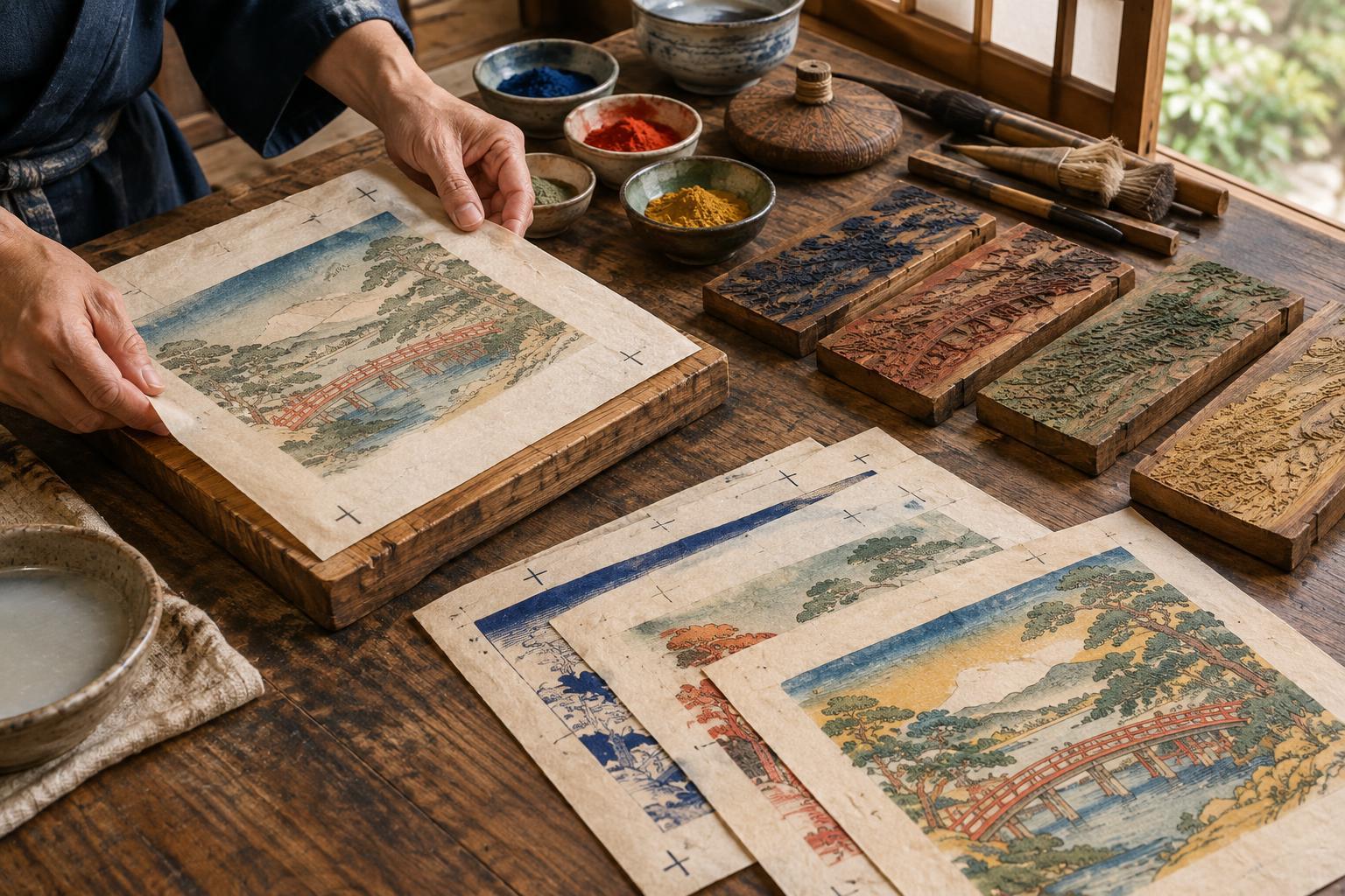
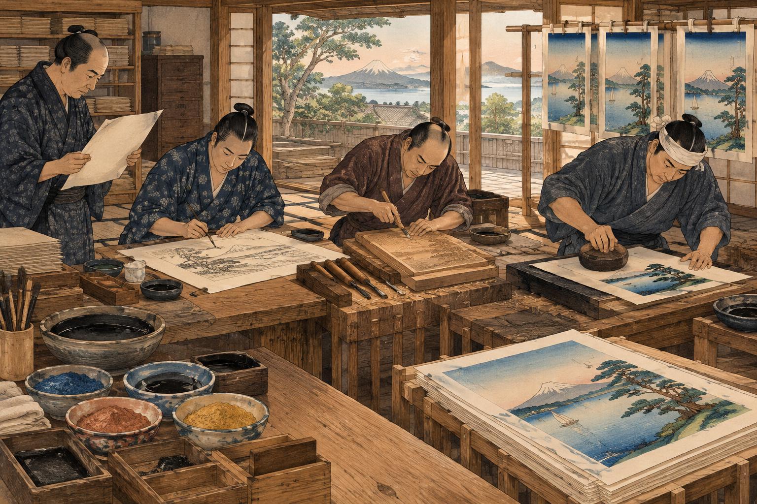
For printmakers, the comparison is especially revealing. Japanese woodblock prints were commonly produced through the coordinated work of a designer, block carver, printer and publisher. Many European artists working in etching or lithography approached their prints through different materials and working relationships. Japonisme therefore did not mean that European printmakers adopted a complete Japanese process. Often, they translated selected visual ideas into the methods already available to them.
Looking beyond the label
Japonisme can be a helpful starting point, but it can also flatten a complex history. Describing a work as “Japanese-inspired” does not tell us which prints its maker saw, what they understood about them, or how closely they studied their makers’ choices. It may also leave Japanese artists unnamed while giving European artists all the credit for an inventive composition.
A more careful comparison begins with specific works. Look at where the main subject sits, how the edges of the image are used, whether color creates depth or pattern, and what role the print was intended to play for its audience. Then look for differences as well as similarities. A cropped figure in a European poster and one in a Japanese woodblock print may produce related effects while serving distinct subjects, viewers and methods of production.
A small study for your sketchbook
To explore the influence without trying to imitate an entire tradition, choose a simple subject such as a plant beside a window. Make three thumbnail sketches. In the first, center the subject and build depth with shading. In the second, crop the plant at the edge and use a strong shape in the foreground. In the third, arrange the scene with a few flat color areas and visible patterns. Note which decisions change the viewer’s attention.
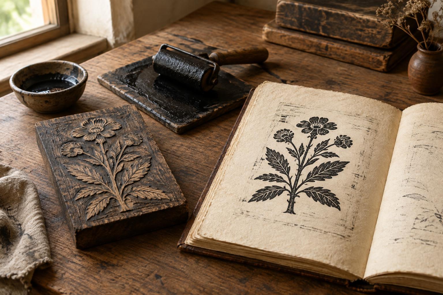
If you develop a sketch into a print, keep the experiment focused: a single linocut block, stencil or two-color reduction print is enough to test how cropping and color work together. The exercise is not a substitute for studying Japanese prints on their own terms. It is a way to notice how artistic ideas travel—and how a change in composition can open up new possibilities in your own work.