Two properties, two different questions
When an ink misbehaves, “too thick” is an understandable diagnosis, but it can hide two different properties. Viscosity describes an ink’s resistance to flowing. A more viscous ink generally takes more effort to spread or move; a less viscous one moves more readily. Tack describes how strongly an ink tends to hold onto a surface as two surfaces separate. At the press, that separation happens when paper lifts from an inked block or plate.
The properties are related, but they are not interchangeable. An ink may be slow to spread on a slab yet release from paper without much pull. Another may roll out readily but feel noticeably sticky as a sheet is peeled away. The distinction matters because adding something to make ink flow more easily may also change its transfer, coverage or drying behavior. Rather than reaching for a modifier first, notice whether the difficulty occurs while rolling or wiping, during transfer, or when lifting the print.
What you can observe in a relief print
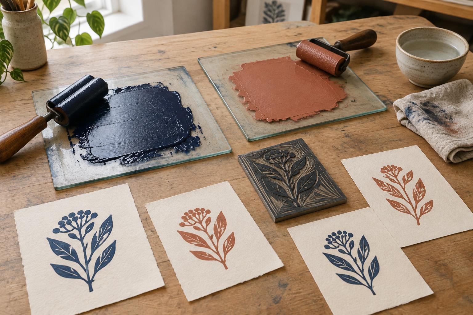
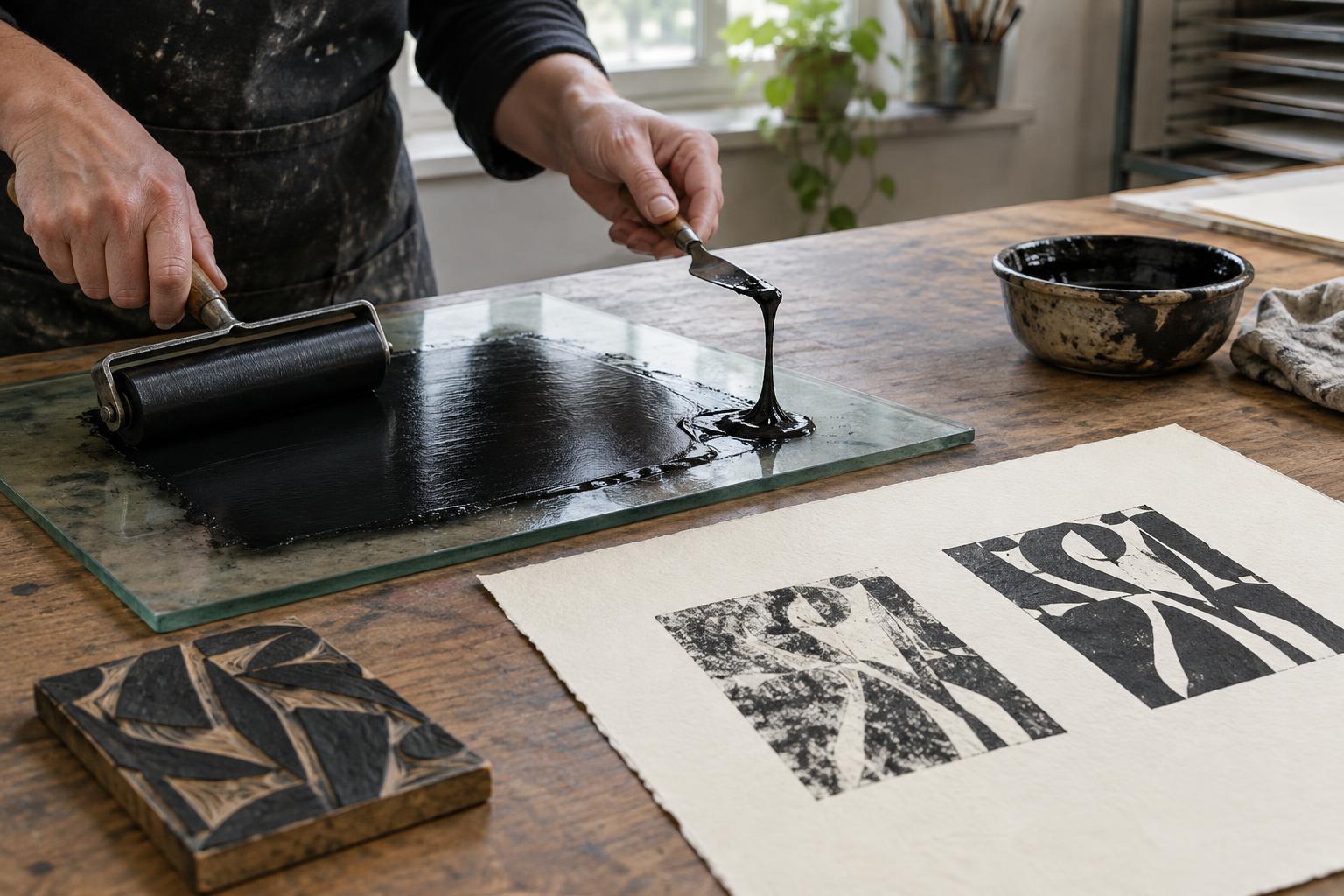
In relief printing, viscosity shows up as you roll out ink and coat the raised surface. Ink that resists spreading can be difficult to distribute evenly, especially if the roller, slab or block is cool. Ink that flows too freely may creep into fine cuts or build up at the edges of shapes. Neither appearance alone proves that viscosity is the only cause: the amount of ink on the roller and the pressure used while inking matter too.
Tack becomes easier to notice when the paper and block separate. A very tacky ink may grip a delicate sheet enough to disturb its surface or make a clean lift awkward. If transfer is patchy, however, low tack is only one possibility. Uneven inking, insufficient contact, paper texture or press pressure can produce similar results. Try a small proof before changing the ink. If the roller is leaving ridges, work on the rollout; if the rollout looks even but the paper lifts roughly, examine the paper and separation.
How the distinction helps with intaglio
Intaglio printing puts ink into recessed lines or textures, then removes it from the plate surface. Here, flow affects how readily ink enters fine marks and how it behaves during wiping. An ink that moves too freely may be harder to wipe to the tone you want; one that resists movement may take more work to push into shallow detail. Plate temperature, wiping material and the way the plate was prepared can all change what you see.
Tack influences how the ink releases from the recesses into dampened paper under pressure. A disappointing line may reflect several interacting causes: ink properties, paper dampness, wiping, plate depth or press settings. Avoid treating one faint proof as a reason to remake the ink. Keep your plate preparation and paper routine steady for a few proofs, then change one variable at a time. That makes it easier to tell whether an adjustment helped.
A simple testing routine before adding anything
Set aside a small, measured portion of ink rather than modifying the whole tin. Note the ink type, paper, room conditions and how the ink feels as you spread it. Make a baseline proof, recording whether the difficulty appears in rollout, wiping, transfer or lifting. For relief, check both the inked block and the printed sheet. For intaglio, compare the wiped plate with the resulting lines and tones.
If you decide to adjust the ink, use only a modifier intended for that particular ink system and follow its instructions. Add a little to your test portion, mix thoroughly and pull another proof with the same paper and press setup. Changing paper dampness, pressure and ink composition together makes the result hard to interpret. Water-based and oil-based inks may respond differently to additions, so a familiar remedy for one product should not be assumed suitable for another. Keep containers labeled and follow the maker’s handling and cleanup guidance.
Build a vocabulary from your own proofs
Useful notes need not sound technical. “Hard to roll thinly,” “fills narrow cuts,” “wipes away quickly” and “paper tugs during lifting” are more informative than “bad ink.” Pair each observation with a proof, and write down what you changed. You may find that a different sheet solves a lifting problem, or that a thinner ink layer improves detail without changing the ink itself.
Tack and viscosity are most useful as diagnostic ideas, not targets with one ideal setting. The right behavior depends on the process, image, paper and desired surface. At the press, start by identifying when the problem appears, make a controlled test, and let the printed sheet—not the appearance of ink in the tin—guide the next adjustment.