Decide What Belongs in the Edition
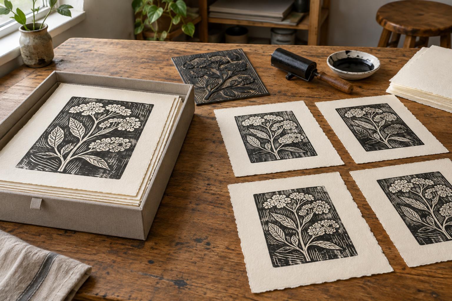
An edition is a group of prints made from the same image with the intention that they belong together. Before numbering anything, decide what makes the impressions consistent: the matrix or digital file used, the paper, the ink colors, and the way the image is printed. Small differences are natural in hand printing, but a deliberate change in color, composition, or printing method may be clearer as a separate edition or a clearly labeled variation.
Choose an edition size you can realistically complete and document. An edition of 20, for example, contains 20 numbered impressions; the number is not a promise that every impression will look mechanically identical. It is a statement about the group you have defined. If you are still testing the image, wait until you have settled on a version before committing to a size. That leaves room to adjust the work without trying to fit experiments into an edition they do not match.
Write the Edition Number
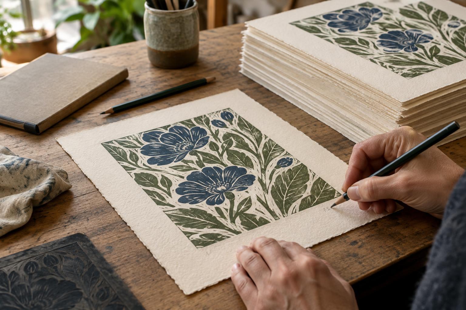
Edition numbers are commonly written as a fraction in pencil beneath the image, usually toward the left of the sheet. In “3/20,” the first number identifies that impression and the second gives the total number of numbered impressions in the edition. Number the prints after they are dry and you have inspected them. A smudged or incomplete impression need not be included simply because it came off the press.
The first number does not necessarily describe the order in which prints were made, nor does it establish a ranking of quality. Aim for a consistent standard across the edition, and assign each accepted impression a unique number. If you print additional impressions later, use the same paper and printing specifications you recorded for the edition, and do not exceed its stated size. If circumstances require a genuinely different version, identify it as such rather than quietly adding it to the original group.
Place the Signature and Title
A familiar arrangement beneath the image is edition number on the left, title in the center, and artist’s signature on the right. You can also add a year if it helps identify the work. These conventions make information easy to find, but the exact placement may depend on the size of the margins and how the print will be displayed. Leave enough clear paper below the image when planning the sheet so the writing does not crowd the artwork or disappear under a mat.
A sharp graphite pencil is a practical choice for many paper prints because it is legible without adding another ink that might compete with the image. Write lightly enough to avoid denting the paper, but firmly enough to be read. Decide whether your signature will use your full name or an established artist name, then keep it consistent throughout the edition. Practice the layout on scrap paper before signing valuable impressions.
Label Proofs and Variations Honestly
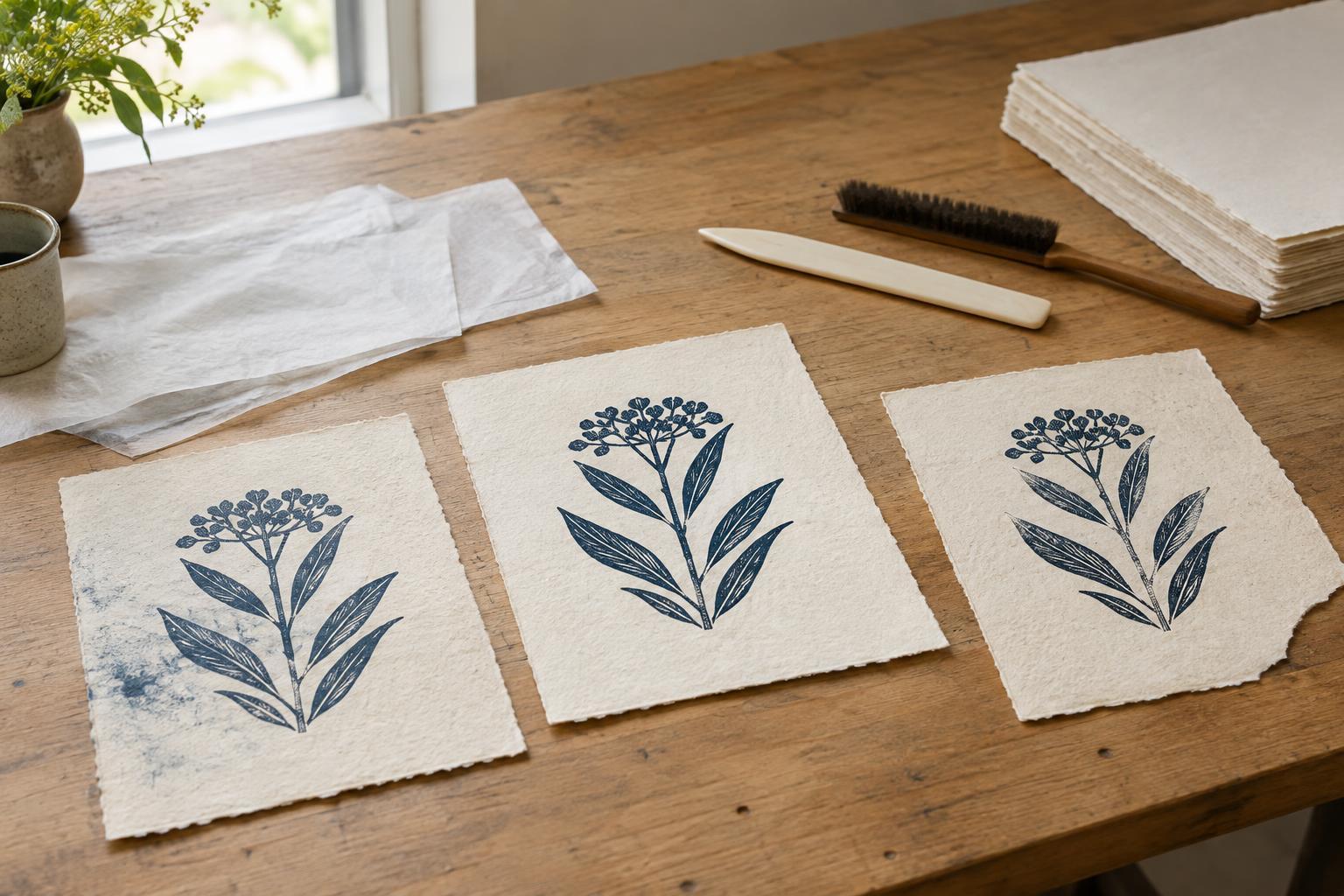
Not every printable sheet belongs in the numbered edition. A trial proof records a stage of testing; an artist’s proof is an impression kept outside the numbered group. You may see labels such as “AP,” but terminology and expectations differ between studios and audiences. What matters most is that a proof is not presented as a numbered edition print. Keep proofs limited and record how many you have retained or distributed.
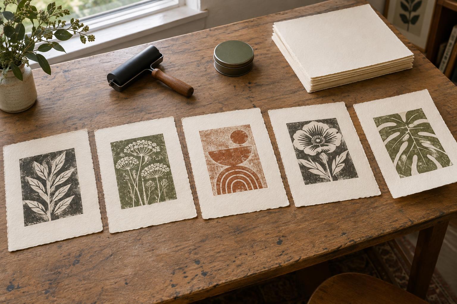
If an impression has an intentional difference, describe it rather than relying on a vague number. A changed ink color might be labeled as a color variation, or you might define and number a separate edition in that color. A monotype or another one-of-a-kind impression should not be made to look like one of several identical prints. Clear labeling respects the character of the work and helps someone encountering it later understand what they are looking at.
Keep an Edition Record
The pencil marks on a print provide a quick reference; a studio record holds the fuller story. For each edition, note the title, process, image and paper dimensions, paper type, inks, edition size, and any proofs or variations. Record which numbers have been printed, accepted, set aside, sold, or given away. A folder, notebook, or simple spreadsheet is enough if you use it consistently.
Store finished prints flat and protected until they are ready for presentation. Check that each sheet’s number matches your record before it leaves the studio, and make any label or accompanying description consistent with the writing on the print. These small habits are especially helpful when an edition is printed over several sessions. Numbering and signing are not just finishing touches: together with a reliable record, they give each impression a clear place in the life of the artwork.