Consistency does not mean identical
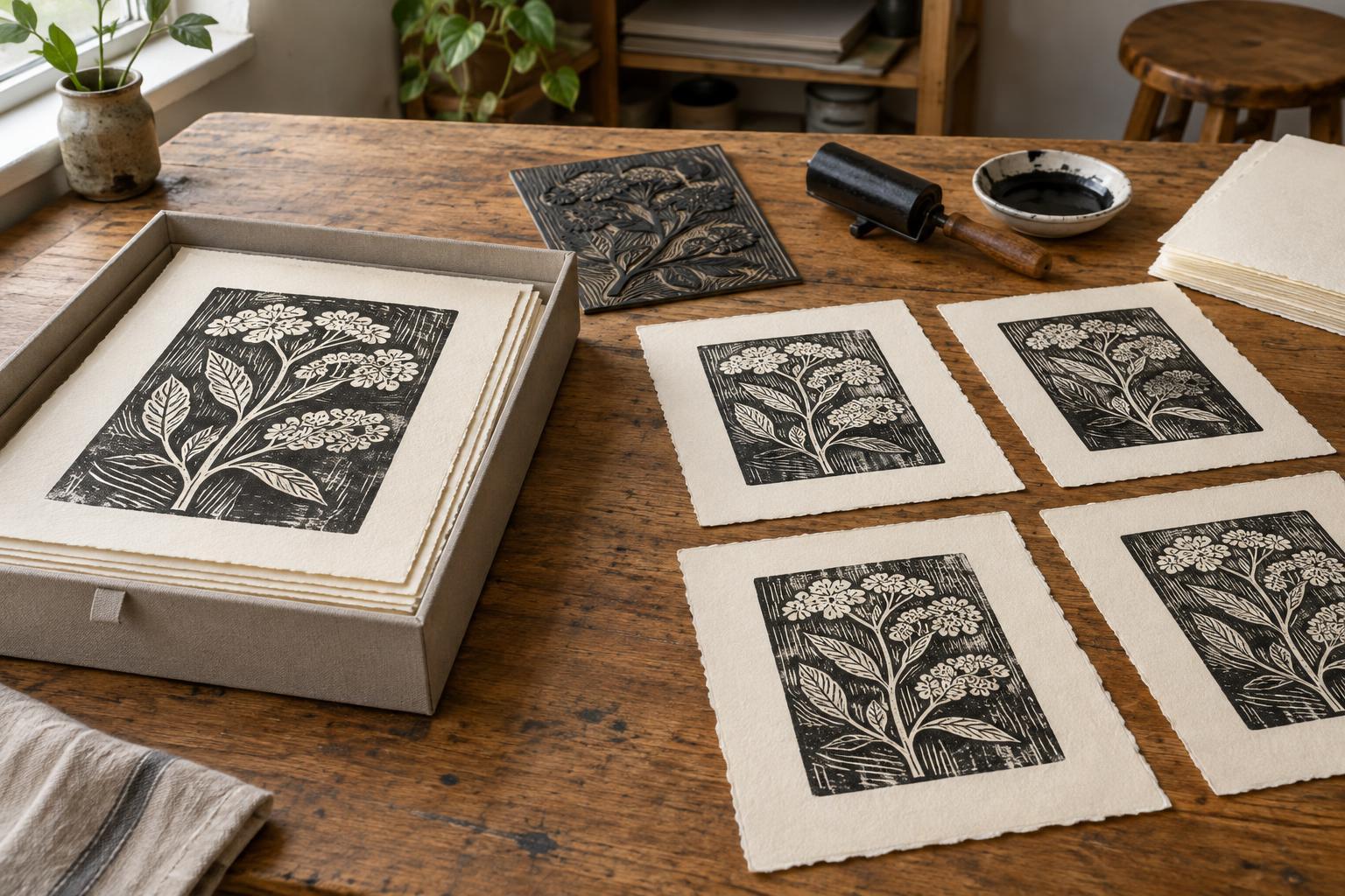
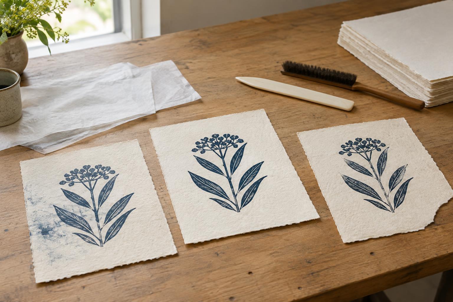
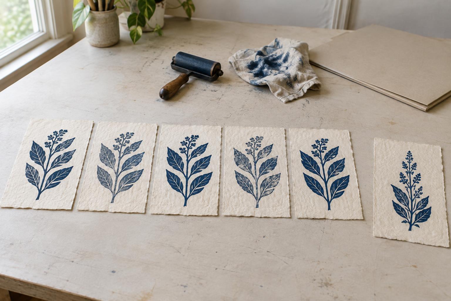
A print edition is a group of impressions the artist has chosen to present as versions of the same work. Even when the same block, plate, or screen is used throughout, small differences can appear. Ink may sit more heavily in one area, a sheet may shift slightly during printing, or a hand-wiped plate may retain a different tone. Those differences are part of many printmaking processes; they do not automatically make each sheet a separate work.
The useful question is whether the prints still share the visual decisions that define the image. Before numbering an edition, identify its essentials: the matrix or set of matrices, the composition, the intended colors, the paper, and the general character of the printing. An edition can allow some variation while holding those elements steady. What matters is that the boundary is deliberate and understandable to someone seeing the prints later.
Set a standard before sorting the prints
Begin with a proof that shows the result you are aiming for. Keep it nearby as you print, and make brief notes about ink mixture, wiping or rolling, registration, paper, and printing order. A proof need not be flawless to be useful: its purpose is to make your choices visible. If you revise the image while working, keep the earlier proofs rather than quietly treating every stage as interchangeable.
After printing, lay the dry impressions out together in good, even light. Compare them for both technical quality and visual effect. A faint area might be a welcome feature of a textured relief print, while a missing patch that interrupts a key shape might not meet your standard. Ask whether you would be comfortable offering any one of the selected prints as a representative impression of this edition. Set aside sheets that do not meet that test, even if they are interesting.
It helps to decide the edition size only after you know how many impressions meet your standard. Numbering a planned quantity before the prints are assessed can create pressure to include weaker sheets. A smaller, coherent edition is easier to explain than one stretched to fill a target.
Know when variation changes the work
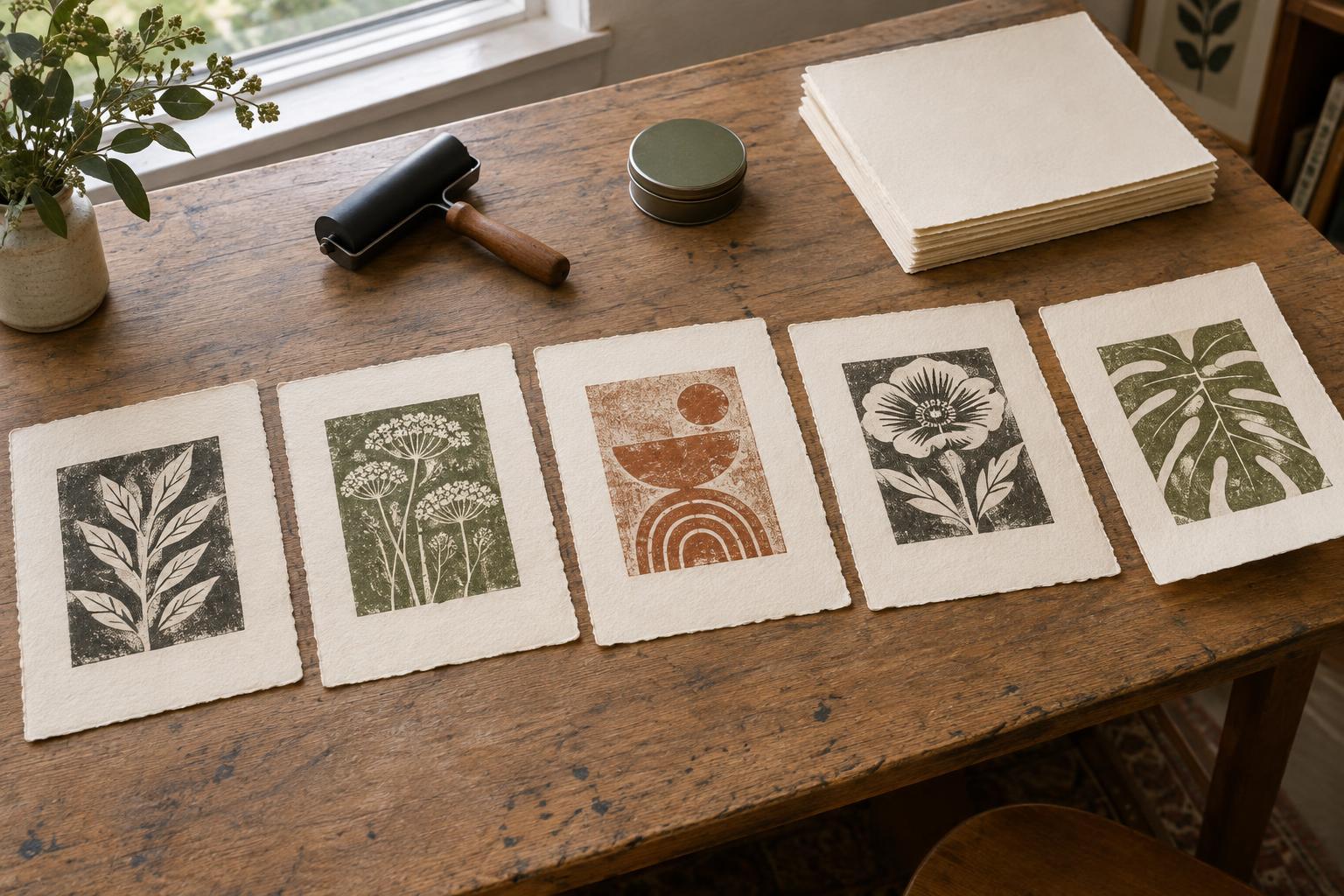
Minor shifts in ink density, plate tone, or registration may fit comfortably within a conventional edition if they do not change the image’s essential appearance. A new color scheme, substantial reworking of the matrix, or a different arrangement of printed elements is a stronger reason to separate the results. There is no universal measurement for that decision: the threshold depends partly on the process and on what you have established as the work’s defining features.
If the matrix changes during printing, consider whether the impressions before and after the change are different states. Record the change and keep each state distinct when presenting the work. If deliberate differences are the point of the project—for example, each impression receives a different color combination—consider describing the group as a variable edition. Make the nature of the variation clear rather than relying on numbering alone to explain it.
Some sheets may belong outside the edition altogether. Working proofs document decisions made along the way; a singular experiment may stand as a unique print. These descriptions are most helpful when used consistently. They tell a viewer what the sheet is, not whether it is better or worse than a numbered impression.
Number and document what you actually made
Once the edition is selected, use a consistent identification system. A notation such as 3/12 identifies one impression within an edition of twelve; it is not a quality ranking. Artists commonly place the edition number, title, and signature beneath the image or in the lower margin, but placement may need to change with the sheet or presentation. The important thing is that the information remains legible and does not conflict with your records.
Keep an edition log with the title, process, image and paper dimensions, paper type, inks or colors, edition size, and any meaningful variations. Note which sheets are proofs, which belong to a separate state, and which did not enter the edition. If you later give, sell, or exhibit a print, a simple record of where that numbered impression went can prevent confusion. Record-making can be modest: a notebook page or a well-kept spreadsheet is enough if you will actually maintain it.
Present the variation honestly
Imagine a run of fifteen linocuts in which ten have a warm gray background and five have a cool blue one. If that color shift noticeably changes the mood, two small editions or a clearly identified variable edition may describe the prints better than one unexplained numbered group. By contrast, slight differences in the strength of the same gray ink may sit comfortably together if all the impressions meet your chosen standard.
When presenting a print, describe any intentional variation in plain language. A note such as “background color varies within the edition” gives a viewer useful context without promising that every sheet is identical. Pair that clarity with careful handling: let prints dry fully, protect their surfaces, and store them flat or in suitable sleeves until presentation. A consistent edition is not one that hides the hand of the maker. It is one whose differences have been considered, selected, and recorded.