What lightfastness means for a print
Lightfastness describes how well a color resists change when exposed to light. An ink may fade, shift in hue or lose intensity over time. For a printmaker, that matters most when a finished print will be displayed rather than kept in a closed portfolio. A color that looks strong when first printed may not remain the same if it receives regular light exposure.
The ink is only part of the picture. Paper can yellow or darken, and coatings, varnishes or other layers can affect what you see. A home test is therefore most useful when it resembles your intended print: the same ink, paper, printing method and approximate ink coverage. It can help you compare choices, but it cannot predict the exact life of an edition.
Prepare matching samples and a protected control
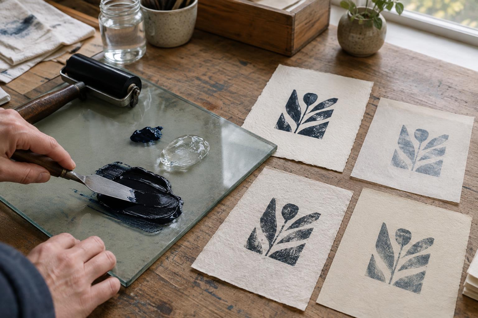
Print several swatches from the same batch of ink on the paper you plan to use. Include an area of solid color and, if relevant, a thinner layer like the one in your artwork. Label each sheet on the back with the ink name or mix, paper, printing method and date. Let the samples dry as you normally would before starting the test; comparing a fresh impression with a fully dried one can make ordinary drying changes look like light damage.
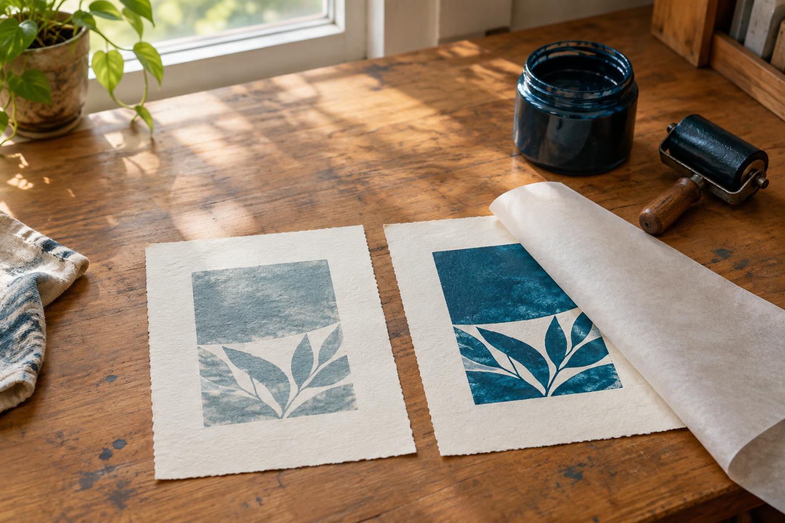
Set aside one complete sample in a dark, dry place as a control. On another sample, cover part of the printed area with opaque, light-blocking material so that one sheet will contain both exposed and protected ink. Keep the cover secure without putting adhesive directly on the image area. If you are testing several colors, print them on separate labeled sheets or leave enough space to compare each color clearly.
Expose, observe and record
Place the test print where it will receive consistent light and where it will not be splashed, handled frequently or overheated. An indoor position near a window is convenient, though window glass, direction and seasonal light all influence exposure. Keep each sample in the same position for the duration of a comparison. Follow any handling and ventilation directions supplied with your inks when preparing the prints.
Check the sample periodically. At each check, bring out the stored control, uncover the protected area briefly and view all three areas under the same neutral-looking light. Look for changes in hue as well as loss of strength. Photographing the samples can support your notes, but camera settings and room lighting may change how a color appears. Written observations, including the exposure location and any changes to it, make the comparison easier to interpret later.
You do not need to declare a pass or fail after a set number of days. Continue until a difference becomes clear or until you have enough information for your project. If the paper changes color, compare unprinted margins too; otherwise, it is easy to attribute every visible change to the ink.
Interpret the result without overclaiming
A noticeable difference between the exposed and protected areas suggests that this particular ink-and-paper combination changed under your test conditions. Little visible difference is encouraging, but it does not prove that the print is permanently stable. Your test may not reveal slow changes, and a different display environment may produce a different result.
Mixed inks deserve their own swatches. The behavior of a blend cannot always be inferred from its individual colors, particularly when one color is present in a thin layer. Likewise, a pale tint may reveal a change that is hard to spot in a dense print. If your work uses transparent layers, test the layered combination on the intended paper rather than relying only on swatches of each ink by itself.
Use the findings when planning a print
Check any lightfastness or permanence information the ink maker provides, and note what it applies to: a pigment, a particular ink formulation or a specified method of testing. Such information can help you narrow your choices; your own swatches show how those choices look in your process. If consistent color across an edition matters, keep a labeled test print alongside your edition records.
When a color shows an unwanted shift, consider testing a different ink or mix before printing the full edition. You can also discuss sensible display care when presenting finished work, such as avoiding prolonged direct sunlight. No framing choice or studio test makes a print immune to change, but a repeatable comparison gives you a more informed basis for choosing materials and describing how your prints should be cared for.