What aquatint brought to Goya’s prints
An etched line can describe the edge of a face, a hand or a doorway. Aquatint can make the space around it feel dim, exposed or uneasy. Francisco Goya used both approaches in prints that examine human behavior, social customs and the consequences of violence. Looking at the relationship between line and tone helps explain why his images remain compelling even when their precise references are difficult to identify.
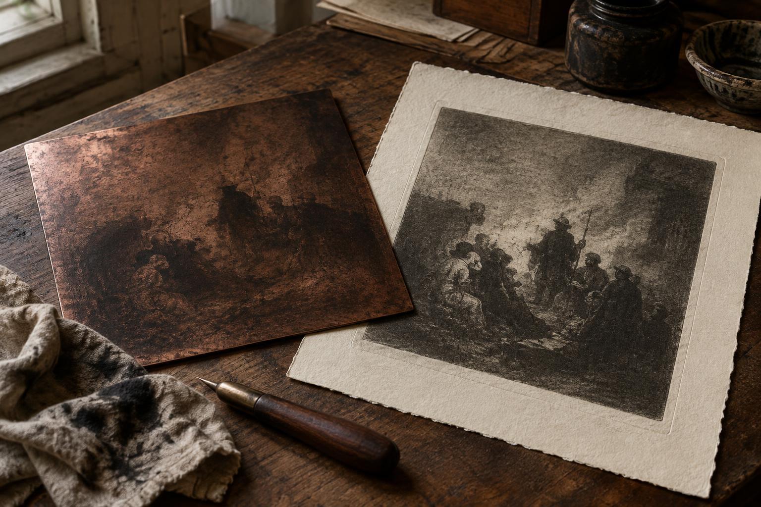
Aquatint is an intaglio process: ink sits in areas bitten into a metal plate and transfers to damp paper under pressure. To create a field of tone, a printmaker dusts the plate with fine resin and fixes it in place. Acid bites the tiny exposed spaces between the particles. When the plate is inked and wiped, those spaces hold ink, producing a textured tone rather than a solid black shape. A longer or repeated bite can deepen an area; stopping out parts of the plate protects them from further biting. The artist can also lighten passages by scraping or burnishing the plate.
The resulting tones are not merely backgrounds. They can conceal details, separate figures from their surroundings or bring a pale face into sharp relief. Goya often set aquatint beside etched outlines, allowing a crisp gesture to emerge from a less certain space. That contrast gives viewers something recognizable to follow while leaving the wider scene open to interpretation.
Los Caprichos: satire in the shadows
In Los Caprichos, Goya turned to images of superstition, vanity, unequal power and everyday foolishness. Its scenes do not work like simple illustrations with a single lesson attached. Figures may appear theatrical or distorted, and a dark setting can make an ordinary social encounter feel unsettling. Aquatint helps create that uncertainty: what is hidden, and what has been brought into the light?
One of the series’ best-known prints, The Sleep of Reason Produces Monsters, places a slumped figure near a gathering of nocturnal creatures. Its contrast between the lit figure and the darker forms around him invites questions about imagination, fear and reason. The image need not be reduced to one fixed message. Its tonal arrangement lets viewers experience the creatures as both visible presences and products of an uncertain mental space.
Across the series, Goya’s tonal choices also guide attention. A relatively light figure may stand out against a dark crowd; a shadow may make a familiar setting seem less secure. When viewing a reproduction, try looking first at the broad light and dark areas before reading a caption or studying individual faces. Notice where your eye goes, then ask how the etched lines complicate that first impression.
The Disasters of War: tone without spectacle
Goya’s later series The Disasters of War takes on conflict and suffering more directly. Its scenes can be stark, yet their force does not depend on lavish detail. Empty or lightly toned areas may leave figures exposed, while darkness can press close around an act of cruelty. Etched lines identify bodies and gestures; aquatint can give those forms weight or make their surroundings feel oppressive.
These prints also show why social critique is not always the same as a neatly stated argument. A viewer may be asked to witness an event without being offered a comforting resolution. Rather than treating tone as decoration, consider what it permits you to see and what it withholds. Does a dark passage clarify a figure’s action, or make the scene harder to grasp? Does a pale area offer relief, or leave someone painfully visible?
The series has a different context and purpose from the satirical Los Caprichos, so the two should not be read as interchangeable. Together, however, they show how flexible Goya’s printmaking language could be. The same resources of line, texture and contrast could support absurdity in one image and a grave account of violence in another.
Reading the printed surface
A useful way to study a Goya print is to separate its effects before putting them back together. First, identify the lightest and darkest zones. Next, follow the etched contours: which details become legible through line rather than tone? Finally, look for transitions. A patch of aquatint may appear even at a glance, but its grain and edges can reveal how deliberately the artist organized the scene.
Remember that an impression is also a physical print. In intaglio, ink, wiping, paper and pressure all affect how a plate’s marks appear. Reproductions are valuable for comparing compositions, but they may flatten subtle differences between a bitten tone and a deep etched line. When you can see an impression closely, let the surface slow your reading. Goya’s critique often lies not only in what he depicts, but in how he makes the viewer search through light and shadow to confront it.