A stencil held in a screen
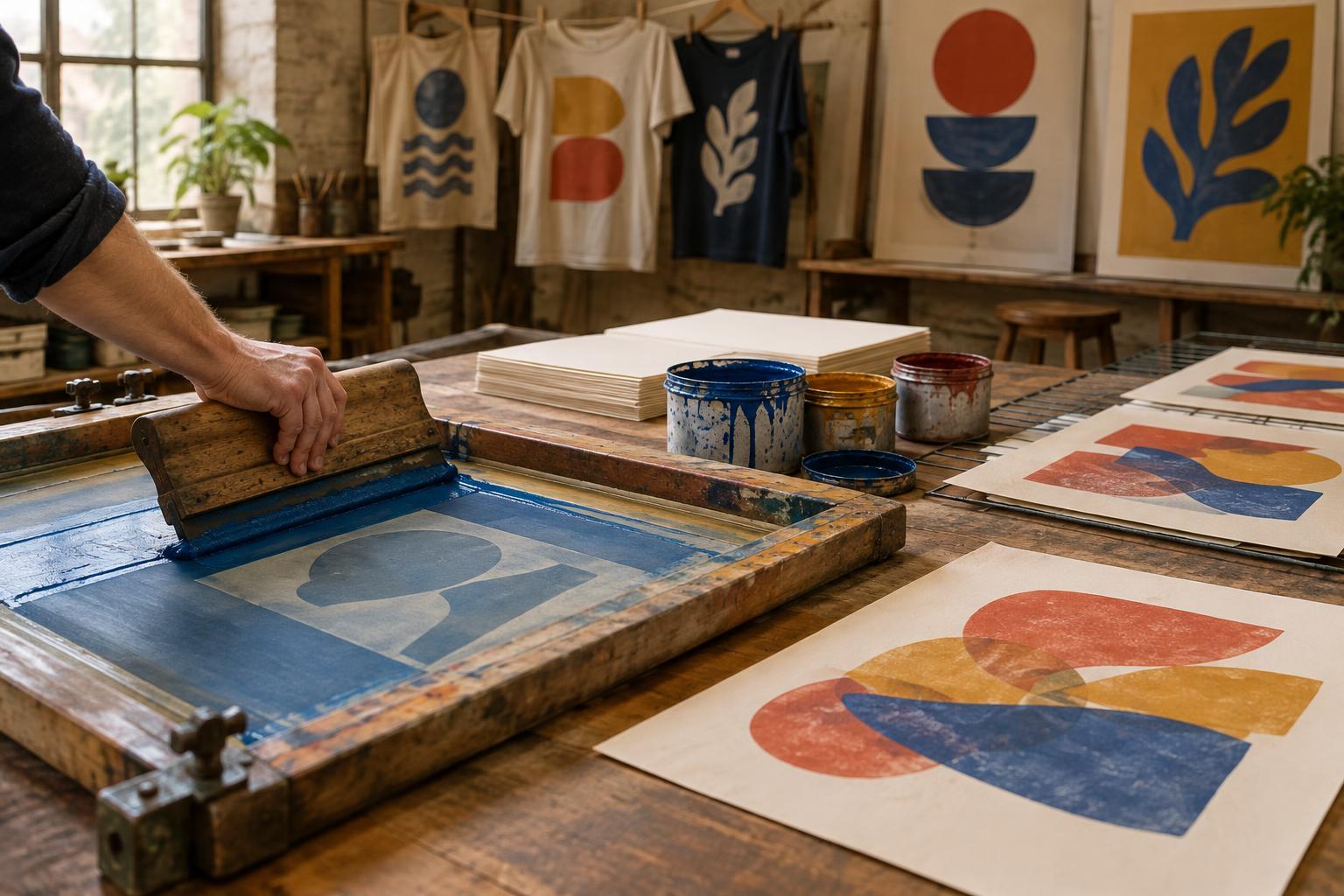
Screenprinting begins with a simple idea: block some areas of a surface and push ink through the open areas. Unlike a loose paper stencil, a screen can hold small shapes and enclosed details in place. Ink is drawn across the mesh with a squeegee, then passes through to paper, fabric or another surface. Each color usually needs its own stencil and printing pass.
Stencil printing has a long history, but it is not the same thing as modern screenprinting. The recognizable screenprinting process developed as makers combined stencils with a fine mesh stretched over a frame. Early screens were often made with silk, which explains the enduring name “silkscreen.” Modern printers commonly use synthetic mesh. That change in material did not alter the basic relationship between blocked areas, open mesh and transferred ink.
A useful process for commercial workshops
In the early twentieth century, screenprinting became useful for work that needed clear, repeatable images. Commercial printers used it for such things as signs, display graphics and textiles. The process could lay down a strong field of color and work on surfaces beyond conventional printing paper. A prepared screen could also be used repeatedly, making it practical to produce a series of similar impressions.
These strengths shaped its visual language. Bold lettering, flat color and sharp silhouettes were well suited to advertising and display. Yet screenprinting was never limited to a single look. Printers could vary the mesh, ink, stencil and printing surface to change the result. An image designed for quick recognition might use only a few colors; a more intricate design could be built through carefully registered layers.
How artists adopted the screen
Artists recognized that a method built for repetition could also support individual choices. In the twentieth century, fine-art printers increasingly explored screenprinting as a medium in its own right. The term “serigraphy” came into use in fine-art circles to distinguish artistic work from commercial silkscreen printing, although both names refer to closely related methods. The distinction was about purpose and context, not a different fundamental way of pushing ink through mesh.
A screen could produce an edition of prints, but it could also invite variation. An artist might change colors between impressions, shift the position of an image or print onto a different paper. Multiple screens made it possible to build depth from flat layers and to create new colors where those layers overlapped. Planning mattered, but so did the surprises that appeared when one printed shape met another.
Images from mass culture enter the gallery
By the mid-twentieth century, screenprinting’s connection to commercial imagery had become part of its appeal to some artists. Pop artists, including Andy Warhol, used the process to repeat and transform images associated with consumer goods, publicity and mass media. In such work, repetition could be more than an efficient production method: it could become part of what the image meant.
Photographic screen processes expanded these possibilities. A light-sensitive coating could help transfer a prepared image to the screen, allowing printers to work with photographic detail alongside hand-drawn marks and flat blocks of color. The results still depended on practical decisions: how an image was separated into printable areas, which inks were used, and how accurately each layer aligned with the next. Even when prints looked mechanically consistent, they remained the products of particular materials and choices.
Reading the history in a print
Screenprinting remains useful to artists because it can move between precision and improvisation. A poster, a fabric print and a gallery edition may share the same basic method while asking for different decisions about durability, surface, color and consistency. Its history is therefore not a simple journey from commerce to art. Commercial printers and artists have continued to borrow approaches from one another.
To look closely at a screenprint, start with its layers. Where do colors overlap? Are edges crisp, or do they show the character of the ink and surface? Do repeated impressions look alike, or has the printer allowed small differences to remain? These questions connect the finished image to the work of making it. They also show why a process designed to reproduce an image can still leave room for an artist’s hand.