Define what belongs together
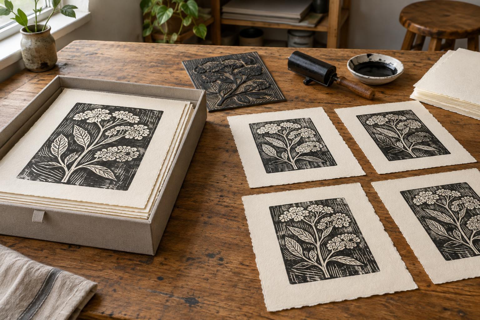
A consistent presentation begins before the prints are finished. Lay out sketches, proofs or completed images and identify what connects them: a subject, a shared plate size, a limited palette or a particular way of using space. Then decide which features should remain steady across the series and which may change. A set of landscapes might use the same paper and sheet size while allowing each image a different arrangement of marks.
Write a brief presentation plan that you can refer to while printing. Include the intended number of images, sheet dimensions, orientation, paper, ink approach and approximate placement of the image on the sheet. This is a guide, not a rule that forbids discovery. If one print needs a deliberate exception, make that choice visible rather than letting it look accidental.
Use paper and margins as a common framework
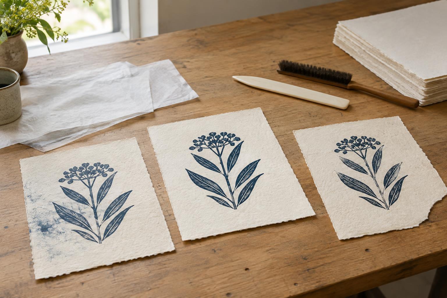
Paper is one of the strongest visual links between separate prints. Using the same paper across a series gives the sheets a shared color and surface character. If a technique calls for different papers, you can still create continuity through similar sheet sizes or a consistent relationship between the image and the edges. Keep a record of the paper you choose so that a later printing session does not introduce an unintended change.
Decide how much blank space the image needs before trimming any sheets. A simple cutting guide and a measured placement mark can help keep margins consistent, especially when several blocks or plates have the same dimensions. Measure from a fixed edge each time rather than estimating by eye. For hand-torn sheets, a small amount of variation may suit the work; aim for a repeatable overall rhythm rather than identical edges.
Let the image influence the final decision. A dense composition may benefit from generous space around it, while a small, quiet image may feel lost on a very large sheet. Test one or two options with spare paper before preparing an entire run.
Set standards for printing and edition records
Consistency does not require every impression to be mechanically identical. Slight differences in inking or pressure can be part of a hand-printed edition. It does help to decide what counts as an acceptable impression: whether fine details should remain legible, how evenly large areas should print and how much variation in color you welcome. Keep a proof nearby as a reference, and compare impressions after they are dry enough to assess fairly.
If you are making numbered editions, decide the edition size for each image and record how many acceptable impressions you produce. A number such as 3/20 identifies the third impression in an edition of twenty; it does not necessarily describe the order in which sheets came off the press. Artists use different practices for signing, titling and marking proofs, so choose a clear system and apply it consistently. If the series contains variable impressions, label them in a way that accurately describes that choice rather than presenting them as identical copies.
A simple worksheet can capture the image title, block or plate details, paper, ink, edition size and any intentional variations. It also helps you keep track of rejected impressions so they are not accidentally mixed into the finished group.
Arrange the series as a visual sequence
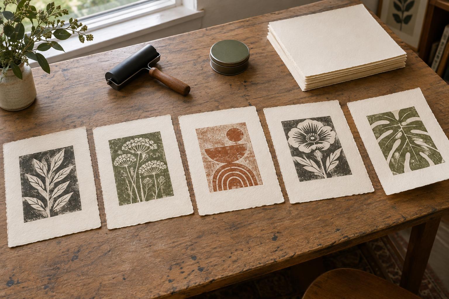
Once the prints are complete, place them side by side at roughly the spacing they will have when displayed. Try more than one order. You might move from light to dark, from simple to complex, or between contrasting images to create a steadier rhythm. Look for unintended interruptions, such as one print appearing higher on its sheet than all the others.
Presentation choices should support that sequence. Matching frames or mounts can create a quiet framework, but they are not the only option. Unframed prints in a portfolio can feel cohesive when sheets are the same size and arranged in a considered order. If you use mounts, test their color and opening size against the entire series, not just a favorite print. Avoid permanent adhesives on the artwork if you want the option to change its presentation later.
Make a final group check
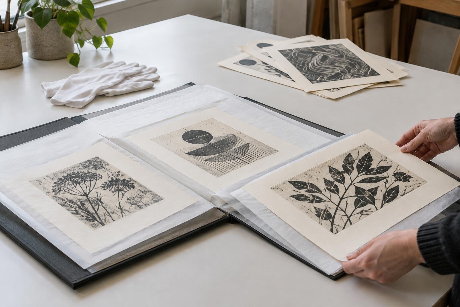
Before calling the series complete, inspect each sheet under similar lighting. Check for stray ink, handling marks, inconsistent trimming and notes placed in noticeably different positions. Give prints appropriate time to dry before stacking or packaging them, and place clean interleaving sheets between them when needed. A quick photograph of the arranged series can help reveal differences that are less obvious when you inspect one print at a time.
Consistency is most useful when it clarifies your intentions. Keep the decisions that help viewers recognize the prints as a group, and leave room for differences that make each image worth looking at on its own.