Start with the sheet, not the label
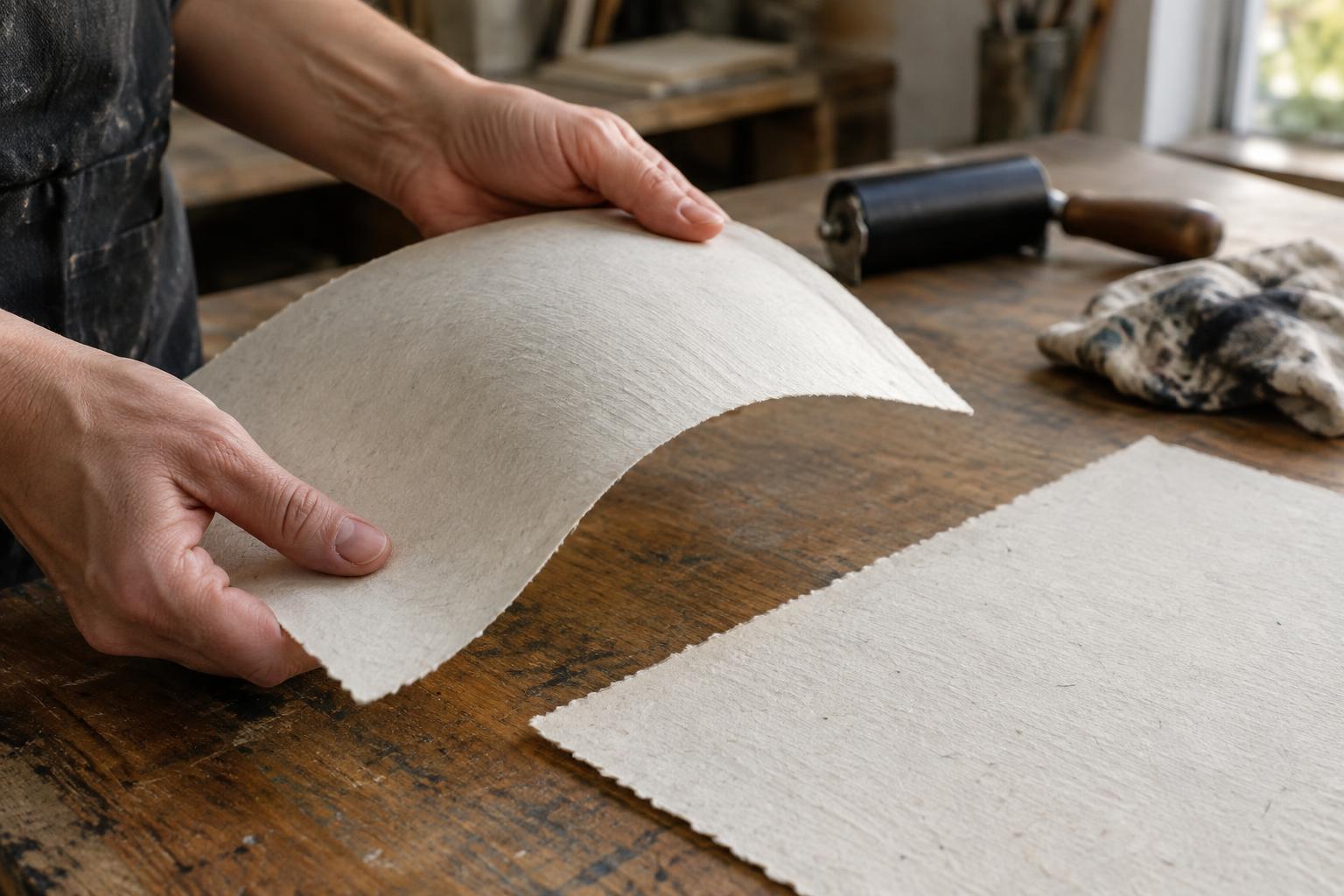
Cotton rag paper is made primarily from cotton fibers, while wood-pulp paper is made primarily from processed wood fibers. That distinction is useful, but it cannot tell you everything about a sheet. Fiber length, sizing, surface texture, weight and manufacturing method all affect how paper handles ink and pressure. A smooth wood-pulp sheet may give a cleaner fine line than a heavily textured cotton sheet; a well-made wood-pulp printing paper may also outperform a lightweight cotton paper in a particular process.
Treat “rag” as a description of fiber content, not a promise that a paper suits every technique. Likewise, “wood pulp” does not automatically mean flimsy or short-lived. When comparing sheets, note their surface, thickness, flexibility and intended use. If the maker provides information about sizing or permanence, keep it alongside your test prints rather than relying on the fiber label alone.
How ink meets the surface
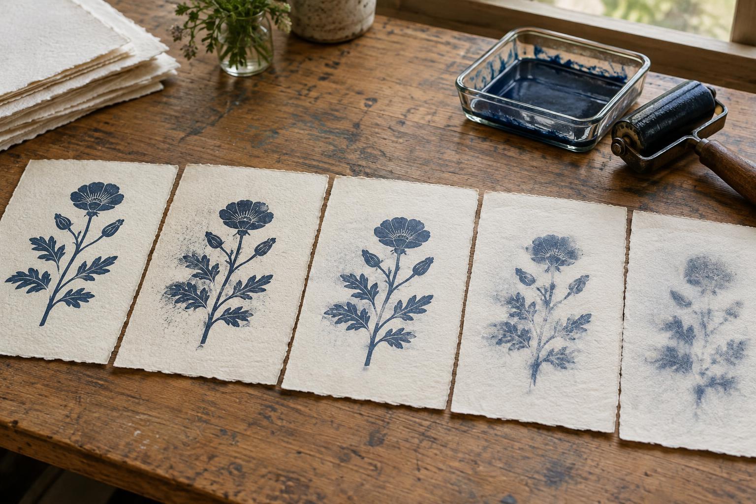
Sizing is a treatment that limits how quickly liquid enters paper. On a strongly sized sheet, ink may sit closer to the surface and retain a sharper edge. On a more absorbent sheet, ink or an ink wash may sink in, soften, or look less saturated. Texture matters too: a pronounced tooth can interrupt a thin layer of relief ink, creating speckling that may be desirable or frustrating depending on the image.
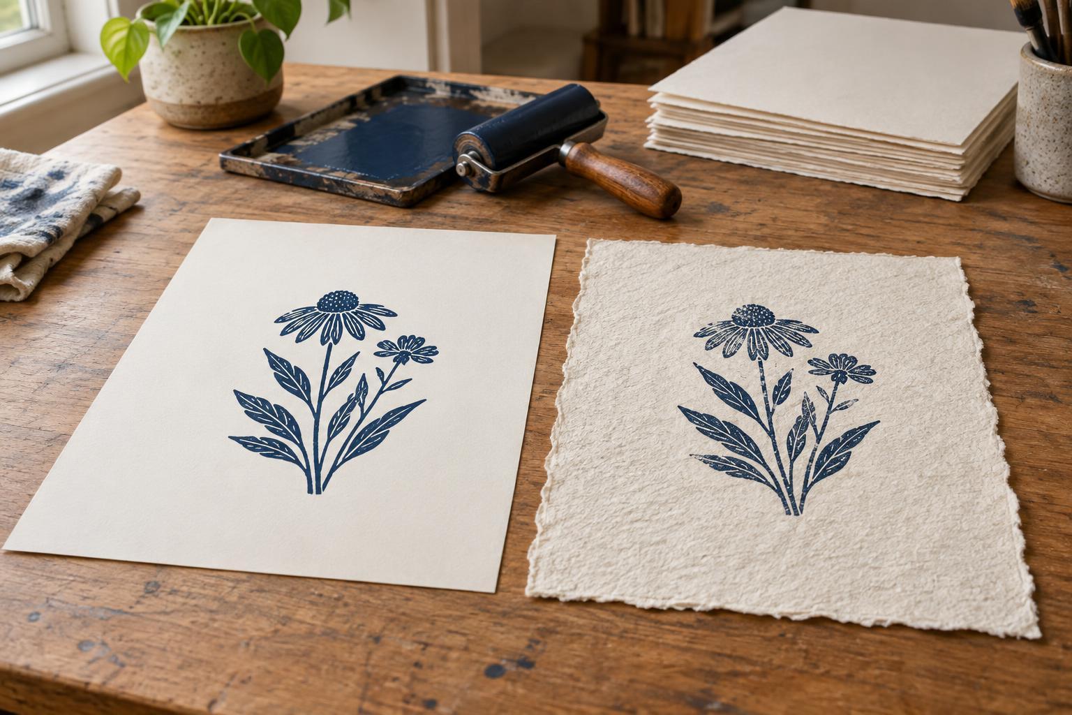
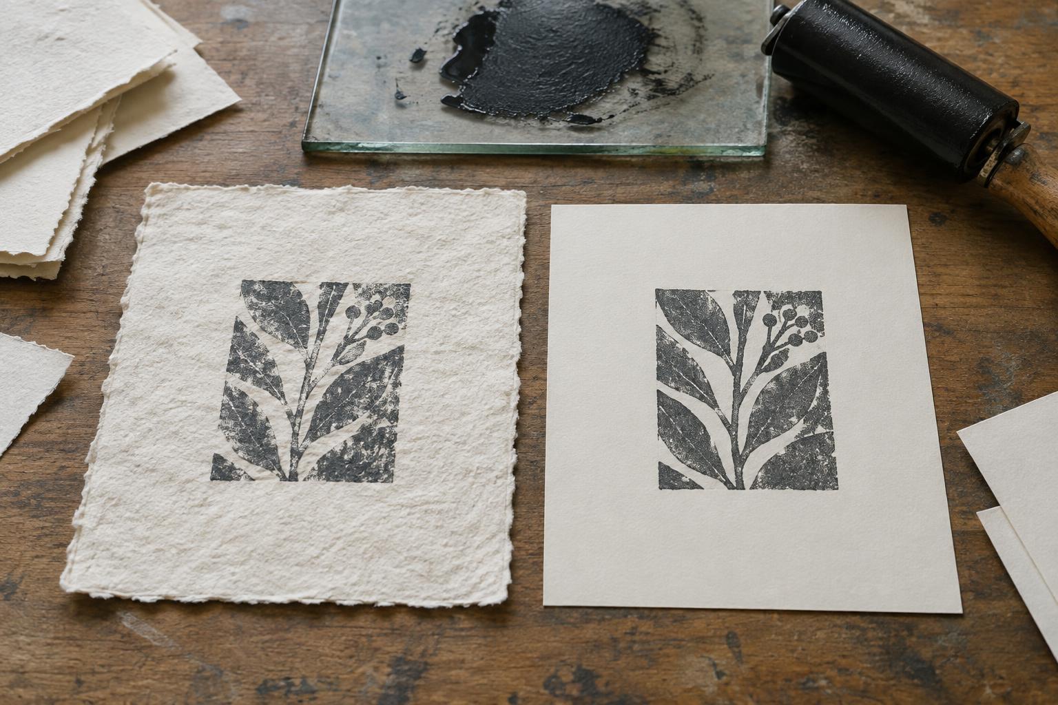
For relief printing, compare how evenly each sheet accepts ink from the raised block. A smooth paper can help with small type or delicate cuts, while a softer, more textured sheet may emphasize the physical character of a hand-pulled print. Water-based inks can respond especially noticeably to differences in absorbency and drying, though the ink formulation also matters. Oil-based inks have their own handling and drying requirements. The most reliable comparison uses the same block, ink, inking amount and pressure on both papers.
Pressure, dampening and paper strength
Intaglio printing often asks more of a sheet than a quick dry relief print. Paper may be dampened so it can reach into etched lines or engraved marks under press pressure. Many cotton printmaking papers are chosen for this work because they can be pliable when damp and withstand substantial handling. That does not mean every cotton sheet should be soaked, or that every wood-pulp sheet will fail: suitable preparation depends on the specific paper and plate.
Wood-pulp printing papers vary widely. Some tolerate damp printing well; others may cockle, tear at an edge, or change surface character after wetting. For either fiber type, test a small piece using your usual dampening method, then let it dry fully. Check whether fine marks transferred, whether the sheet flattened as expected, and whether its surface remained intact. In screen printing or other processes involving repeated passes, also watch for stretching or changes in registration as moisture accumulates.
Appearance, storage and cost
Paper color shapes the apparent color of the ink. A warm white may soften a high-contrast image; a bright white can make it feel crisper. Neither look belongs exclusively to cotton or wood pulp. Compare sheets under the light in which the finished print will be viewed, and let test impressions dry before judging their color and surface.
If long-term storage matters, look beyond the fiber name. Processing, remaining lignin, additives and storage conditions can influence how a sheet ages. Terms such as “acid-free” describe only part of that picture; product specifications are more helpful than assumptions based on price or appearance. Keep finished prints clean, dry and supported, and avoid direct sunlight when displaying them.
Cost matters for an edition as well as for a single print. An affordable sheet that prints consistently may be the better choice for a large run or a workshop. A more expensive cotton sheet may be worthwhile when its feel, damp-printing behavior or particular surface contributes to the work. Allow extra sheets for setup, proofs and mistakes regardless of which material you choose.
Run a small, useful comparison
Cut two or three pieces from each candidate paper, keeping their printing orientation and dimensions the same. Print the same image with the same ink and pressure, changing only the paper. For a damp process, record how long each piece was dampened and how it felt at the press. For a dry process, note whether the sheet slipped, picked up ink evenly or needed a change in pressure.
Label the proofs on the back. Once dry, compare edge sharpness, dense ink areas, fine detail, paper deformation and the feel of the finished print. Decide which differences serve the image rather than looking for one universal winner. Before starting an edition, buy enough of the chosen sheet from the same stock where possible and repeat the test if the paper, ink or printing method changes. A modest proofing session can prevent an entire run from becoming an experiment.