Color before it was commonplace
A color picture is easy to overlook when images surround us. For much of printmaking history, however, reproducing one in quantity meant solving a difficult problem: how could a printer make many copies with consistent color without painting each one by hand? Chromolithography offered an influential answer. Developed in the nineteenth century from lithographic methods, it used successive impressions of colored inks to build a complete image.
Chromolithography did not make every color print cheap. Preparing an image could demand considerable skill, time and equipment. Once that preparation was complete, though, a workshop could print multiple copies from the same set of printing surfaces. For publishers making images in quantity, that changed what color reproduction could be used for and who might encounter it.
Building an image one color at a time
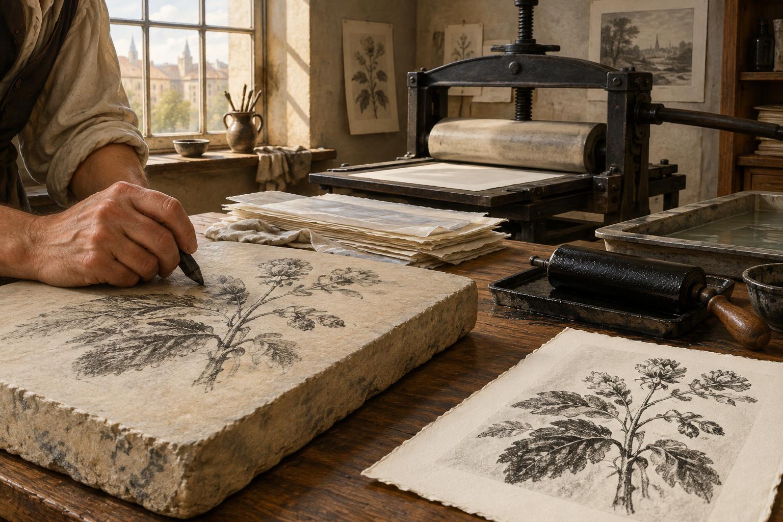
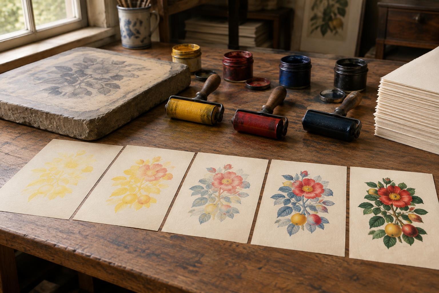
Lithography relies on the tendency of greasy drawing materials and water to repel one another. An artist or specialist draws on a prepared stone, which is then processed so that ink adheres to the image areas while damp non-image areas resist it. In chromolithography, the printer prepares a separate stone for each color or component of the image. Paper passes through the press repeatedly, receiving another layer of ink on each pass.
Those layers must align. Printers use registration marks or other guides to place each impression in the intended position. A slight shift can create a colored fringe; a deliberate overlap can deepen a shadow or produce a new hue. The number of stones varies with the image and the desired effect. A simple design may need relatively few, while a richly modeled picture can require many carefully planned layers.
The work involves more than assigning one stone to each color an observer might name. Printers must decide where an ink will appear, how transparent or opaque it should be, and how it will interact with inks already on the sheet. Proofs let the workshop check those choices and make adjustments before producing a full run. The finished print may look seamless, but it is the result of many separate decisions.
Why repeated printing mattered
Earlier ways of adding color to prints included hand coloring, which could be beautiful but required work on each sheet. Chromolithography shifted much of that effort toward preparing and coordinating the printing surfaces. This made repeated color images more practical when a publisher expected to produce enough copies to justify the setup.
Color lithographs appeared in such varied forms as posters, illustrated books, labels, greeting cards and educational pictures. These objects did not all serve the same audience or command the same price. Together, they show how color printing could move beyond a single original artwork or a specially colored print and become part of ordinary visual culture.
Affordability is therefore a relative term. A finely made chromolithograph could still be expensive, and a short print run might offer little saving. But the possibility of distributing many similar impressions helped broaden access to colorful images. It also gave artists, printers and publishers a shared challenge: how to make a design striking enough to work both as an image and as a repeatable sequence of inks.
What to look for in a chromolithograph
If you can examine a chromolithograph closely, look at the edges of colored shapes. Small gaps or overlaps may reveal how separate impressions meet. Areas that appear to contain a single complex tone may be built from several layers. Registration is often most noticeable where a dark outline meets a bright fill or where fine lettering sits over a colored ground.
The paper matters too. Its surface and color affect how the inks appear, while repeated passes through a press call for reasonably consistent handling. The printed sheet is not merely a neutral carrier: it is part of the image-making system. When comparing examples, notice whether the printer relies on broad flat areas, delicate tonal transitions or a combination of the two.
A useful lesson for printmakers today
Chromolithography is worth studying even if you never work with lithographic stones. Its central idea—planning an image as aligned layers—connects to many forms of multicolor printmaking. A beginner can explore that idea with two simple printing surfaces, two inks and a few trial sheets. Print one shape, then add a second color while trying both precise alignment and intentional offset. Keep the trials side by side to see how registration changes the image.
That small exercise also makes the history more tangible. The spread of affordable color images depended not on a single magical invention but on repeatable processes, practiced workers and thoughtful design. Every surviving print carries traces of that collaboration, from the bold decisions visible at a distance to the meeting of ink layers visible up close.