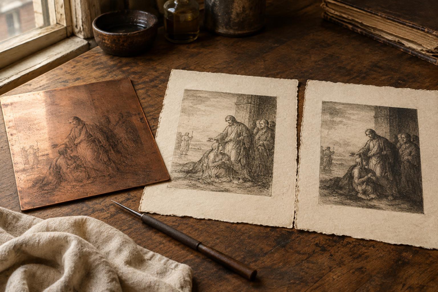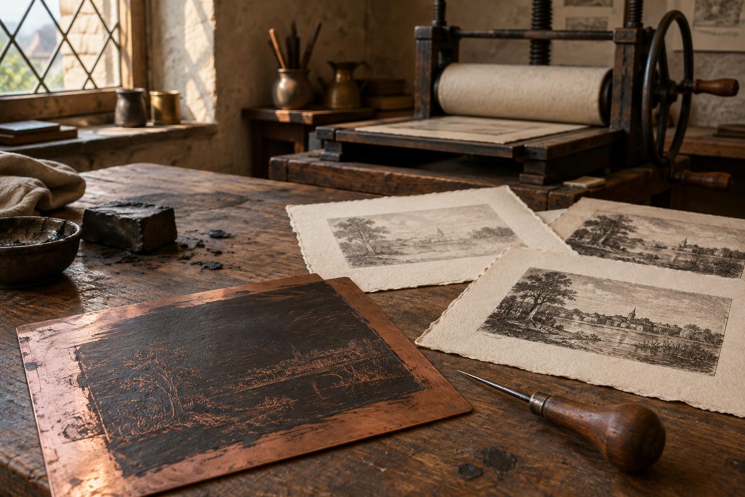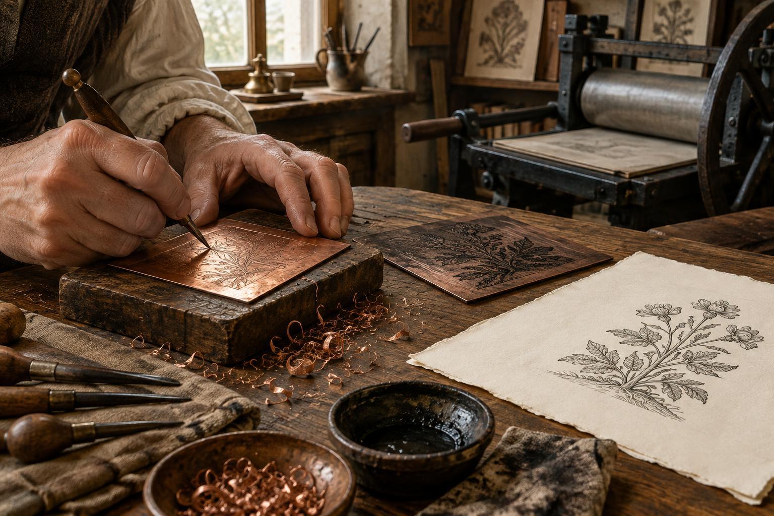
What makes a woodcut chiaroscuro?
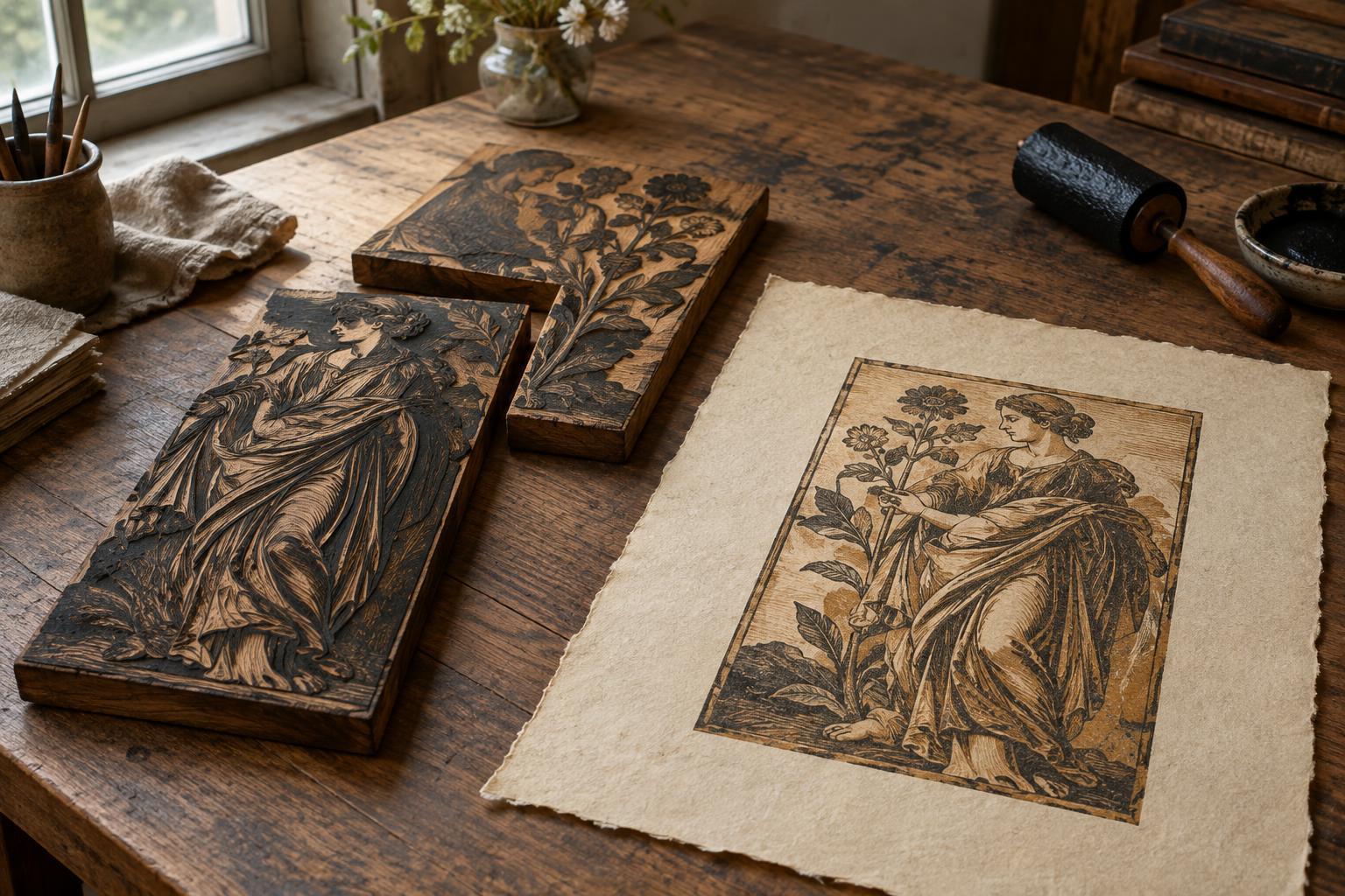
In an ordinary woodcut, the raised parts of one carved block receive ink and print onto paper. A chiaroscuro woodcut uses two or more blocks for the same image, each contributing a different tone. Together they can suggest illuminated forms, deep shadows and the middle values between them. The name refers to the contrast of light and dark, but the effect depends just as much on how those values fit together.
A common arrangement pairs a dark line block, which defines contours and details, with one or more tone blocks. Other prints rely chiefly on areas of tone rather than a continuous dark outline. The paper may supply the lightest passages: a highlight is sometimes an unprinted shape deliberately left open. This is why a seemingly simple patch of white can be as important to the design as a printed shadow.
A Renaissance technique with varied approaches
Printmakers in Renaissance Europe explored multi-block woodcuts in the early sixteenth century, particularly in German-speaking regions and Italy. Hans Burgkmair and Ugo da Carpi are among the artists closely associated with the technique. Their work does not point to a single fixed recipe. Different makers chose different numbers of blocks, color relationships and balances between line and tone.
The method suited an interest in drawings made on colored paper with ink and pale highlights. A print could evoke that combination while allowing an image to be impressed more than once. It was not simply a way to imitate a drawing, though: cutting separate blocks required the artist to decide which shapes belonged to each tonal layer. Those decisions gave the finished print its own graphic character.
How separate blocks become one image
Each block carries only part of the composition. Imagine a figure beside a wall: one block might print the broad middle tone, another the darkest recesses, and a third the defining lines. Before carving, the design has to be divided so that those parts make sense both separately and together. A tone block can be carved to leave a blank highlight within a printed field, while a darker block adds depth where the two layers overlap.
The printer inks and prints the blocks one at a time onto the same sheet. Placement matters at every pass. If the sheet shifts, an edge intended to sit against a contour may appear beside it instead. Printmakers can plan for small variations by allowing adjoining shapes to overlap, but careful registration remains essential. The order of printing also affects the result: a dark layer printed over a lighter one may read differently from the same tones arranged in another sequence.
Reading a finished impression
When looking at a chiaroscuro woodcut, start by finding the lightest value. Is it the bare paper, or has a pale ink been printed? Then follow one middle tone across the image. Its shapes may reveal the extent of a single block. Finally, look at the darkest passages: are they built from an outline block, a broad shadow block, or overlapping printed areas? These questions help make the construction visible without reducing the image to a technical puzzle.
Look closely at boundaries, too. A narrow gap between colors might be an intentional glint of light or a slight difference in registration. Neither possibility should be assumed from one detail alone. Impressions made from the same set of blocks can also look different if ink colors, inking or paper vary. As a result, the particular sheet in front of you matters, not just the carved design.
Try the principle on a small scale
To understand the historical method, try planning a two-tone image before cutting anything. Draw a simple subject with a clear light source, then separate it into paper white, a middle tone and a dark tone. Make two tracing-paper overlays: one for each printed value. Check that the image remains legible when the overlays are combined and that important highlights stay open.
A beginner can test the plan with two small relief blocks, printing the lighter tone first and the darker tone after it dries. Mark a consistent corner or use a simple registration guide to place each sheet. Keep the first edition small so there is room to adjust inking and alignment. The exercise offers a useful insight into Renaissance chiaroscuro woodcuts: their sense of light begins not with more colors, but with a thoughtful division of the image.